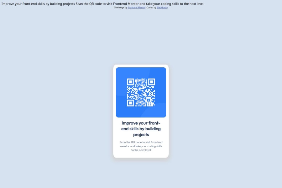
Design comparison
Solution retrospective
I'm fairly new to web dev, so being able to write the HTML structure and CSS pointers without GPT or overflow got me hyped
What challenges did you encounter, and how did you overcome them?Initially, I had everything set in place and looked good, until i resized the window and everything distorted. After some research, changing all pixelated sizes to percentages helped with the distortion.
What specific areas of your project would you like help with?Despite my solution looking somewhat similar to the provided answer, I still think my ratios are off, and Im not sure it looks like what its supposed to look like when you resize the window. So help in that regard would be nice.
Community feedback
- @Joshtemi0Posted 9 months ago
From the little I know
First you should try and use external link for your css. And for the resizing of screen. You can use Media query and the normal one if your css is properly done
And also checking your code is saw outer-box which I don't know that it means, is a class for a <div> and container again in a <div>
<div class="outer-box"> (this ) <div class="container">To me you should leave only the container or outer-box than when giving it it properties you go like this width: 15rem; ---- This will give a specific width no mater the size of the screen instead of the % which will be the 20 percent of the screen even if the screen is 1px it will take 20% of the screen size also Do not use percent(%) use others like px, rem for your outer-box or container
I hope this solve the problem
0
Please log in to post a comment
Log in with GitHubJoin our Discord community
Join thousands of Frontend Mentor community members taking the challenges, sharing resources, helping each other, and chatting about all things front-end!
Join our Discord
