

Design comparison

Community feedback
- P@Islandstone89Posted 7 months ago
HTML:
-
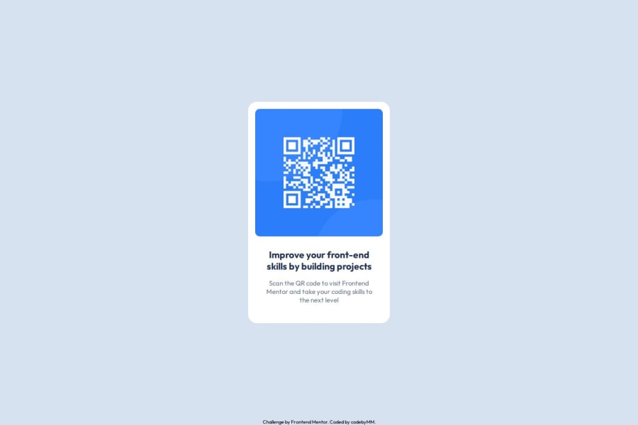
The alt text must also say where it leads(the frontendmentor website). A good alt text would be "QR code leading to the Frontend Mentor website."
-
I would change the heading to a
<h2>- a page should only have one<h1>, reserved for the main heading. As this is a card heading, it would likely not be the main heading on a page with several components. -
Do not use
<br>to force text onto a new line. The text should flow naturally, and all styling, including space between elements, should be done in the CSS. -
Text should always be wrapped in a meaningful element, never in divs alone. Hence, the footer text needs to be wrapped in a
<p>.
CSS:
-
Including a CSS Reset at the top is good practice.
-
I would recommend adding
1remofpaddingon thebody, to ensure the card doesn't touch the edges on small screens. -
On the
body, changeheighttomin-height- this way, the content will not get cut off if it grows beneath the viewport. Remove thewidth, as thebody(and other block elements) take up the full width as the default. I would also addgap: 2rem, and removeposition: fixedon the footer. -
Remove all widths, max-widths and heights in
pxand%. -
Add a
max-widthof around20remon the card, to prevent it from getting too wide on larger screens. -
font-sizemust never be in px. This is a big accessibility issue, as it prevents the font size from scaling with the user's default setting in the browser. Use rem instead. -
Paragraphs have a default value of
font-weight: 400, so there is no need to declare it. -
Since all of the text should be centered, you only need to set
text-align: centeron the body, and remove it elsewhere. The children will inherit the value. -
On the image, add
display: blockandmax-width: 100%- the max-width prevents it from overflowing its container. Without this, an image would overflow if its intrinsic size is wider than the container.max-width: 100%makes the image shrink to fit inside its container.
Marked as helpful1@codebyMMPosted 6 months agothanks for the insight sir @Islandstone89 . Appreciate it so much..
1 -
- @Grimm-NPosted 7 months ago
Thank you for your work on the code! It actually inspired me to add a footer to my project, even though it wasn't in the original assignment. The implementation looks great overall, though I noticed a slight mismatch in the spacing and font size compared to the design. However, I find the execution to be more visually pleasing than the design itself; the text looks more harmonious. Great job!
P.S.: U forgot about the shadow ;-)
Marked as helpful0 - @amontesinoPosted 7 months ago
The font is slightly smaller than the design spec (this could very well be a resolution thing, the font size appears correct in the code!), and the container is missing a box-shadow, but otherwise all other dimensions of the container and elements within it match the spec. Great job using --root variables for colors as well!
Marked as helpful0 - P@QLopes22Posted 7 months ago
Your code looks very organized, great use of the comments.
0


Please log in to post a comment
Log in with GitHubJoin our Discord community
Join thousands of Frontend Mentor community members taking the challenges, sharing resources, helping each other, and chatting about all things front-end!
Join our Discord