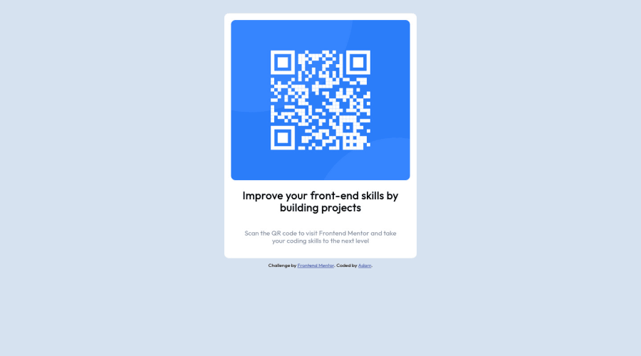
Design comparison
Solution retrospective
Margin Issues
I have issues with margin when it comes to firefox. The site may look different on firefox as compared to chrome. Any idea on how to solve this?
Community feedback
- @madosyPosted over 1 year ago
Rather than setting discrete margin values on .qr-card-and-content, I would align it to center by making the body into a flex container. The reason you don't want to use discrete margin values to align is because depending on the browser window size, your QR code component can look very different: https://imgur.com/hNuIYNs
As for the question about margins looking different on firefox vs. chrome, I wasn't able to discern any differences on my computer--the margins were the same when the window sizes were the same when I inspected each element in developer tools. I suspect that the issue may be related to setting discrete margin values but I would advise using the inspect tool yourself to check the margin values and see where the differences are. https://imgur.com/h9c0ibC
Marked as helpful1 - @0xabdulkhaliqPosted over 1 year ago
Hello there 👋. Congratulations on successfully completing the challenge! 🎉
- I have other recommendations regarding your code that I believe will be of great interest to you.
HTML 🏷️:
- This solution generates accessibility error reports, "All page content should be contained by landmarks" is due to
non-semanticmarkup, which lack landmark for a webpage
- So fix it by replacing the
<section class="site-content">element with the semantic element<main>along with<section class="attribution">into a<footer>element in yourindex.htmlfile to improve accessibility and organization of your page.
- What is meant by landmark ?, They used to define major sections of your page instead of relying on generic elements like
<div>or<span>
- They convey the structure of your page. For example, the
<main>element should include all content directly related to the page's main idea, so there should only be one per page
HEADINGS ⚠️:
- And, this solution has also generated accessibility error report due to lack of level-one heading
<h1>
- Every site must want at least one
h1element identifying and describing the main content of the page.
- An
h1heading provides an important navigation point for users of assistive technologies, allowing them to easily find the main content of the page.
- So we want to add a level-one heading to improve accessibility by reading aloud the heading by screen readers, you can achieve this by adding a
sr-onlyclass to hide it from visual users (it will be useful for visually impaired users)
.
I hope you find this helpful 😄 Above all, the solution you submitted is great !
Happy coding!
Marked as helpful1@AdamR22Posted over 1 year agoThank you.
Any recommended sites or resources that I can use to read more on accessibility?
0 - @fatygaPosted over 1 year ago
Hi! Well done!
Here is some tips:
- Try to use
<img>tag for qr code image instead of setting background on div(because this particular image is not designed to use it as background) - Change margins units to
remorem. The%is relative to parent, and it can result with weird behaviour like in your case - Also don't forget about
<h1>tag which is necessary on every website and consider nesting it in<header>tag in addition.
I hope I helped.
1@AdamR22Posted over 1 year agoThank you.
If I may ask, apart from this particular instance, where the image isn't designed for background use, are there any advantage to using the
<img>tag as compared to using an empty div and setting a background image to it or is it a case by case type of thing.0 - Try to use
Please log in to post a comment
Log in with GitHubJoin our Discord community
Join thousands of Frontend Mentor community members taking the challenges, sharing resources, helping each other, and chatting about all things front-end!
Join our Discord
