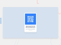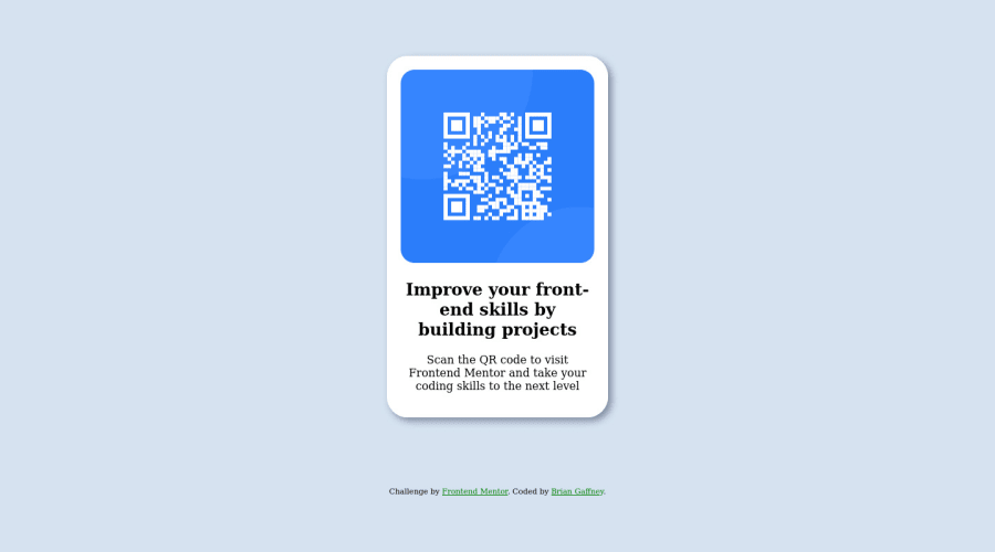
Design comparison
SolutionDesign
Community feedback
- @gomesemogPosted over 2 years ago
Hello Brian! That's a good work overall bro, but you should pay attention to the typography that the challenges provide you to use, go to the styles-guide doc inside the folder to see things as colors, typo, etc. It helps a lot and make things much easier and close to the original solution.
They also provide the font-size pattern you should be applying in your solution.
be good!
Marked as helpful0
Please log in to post a comment
Log in with GitHubJoin our Discord community
Join thousands of Frontend Mentor community members taking the challenges, sharing resources, helping each other, and chatting about all things front-end!
Join our Discord

