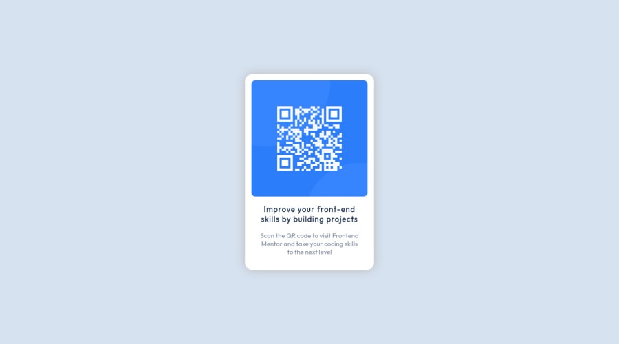


Design comparison

Solution retrospective
Text with boldness= 700 does not look as bold as in preview. Any ideas, how could I had made it bolder, without making it blurry ,like with text-shadow?
I appreciate any suggestions on good practices, and better quality html/css I could implement ^^
Community feedback
- @joangutePosted over 2 years ago
Hi, it seems you are importing your font in the wrong way. This should be the code :
<link href="https://fonts.googleapis.com/css2?family=Outfit:wght@400;700&display=swap" rel="stylesheet">Then you can change the font size in yourh3, do it a bit bigger or the correct way:It is having an
h1as the main heading, because it is the only title in the only component. If the predeterminateh1size is too big you can use CSS to do it smaller, there is no problem with that.Marked as helpful1 - @correlucasPosted over 2 years ago
👾Hi @Deelite34, congratulations on your solution!👋 Welcome to the Frontend Mentor Coding Community!
Great solution and a great start! From what I saw you’re on the right track. I’ve few suggestions for you that you can consider adding to your code:
- Use
<main>instead of a simple<section>this way you improve the semantics and accessibility showing which is the main block of content on this page. Remember that every page should have a<main>block and that<div>doesn't have any semantic meaning. - Replace the
<h2>containing the main title with<h1>note that this title is the main heading for this page and every page needs one h1 to show which is the most important heading. Use the sequence h1 h2 h3 h4 h5 to show the hierarchy of your titles in the level of importance, never jump a level. - Add a margin of around
margin: 20pxto avoid the card touching the screen edges while it scales down. - Use relative units as
remoreminstead ofpxto improve your performance by resizing fonts between different screens and devices. These units are better to make your website more accessible. REM does not just apply to font size, but to all sizes as well.
Here's my solution for this challenge if you wants to see how I build it: https://www.frontendmentor.io/solutions/qr-code-component-vanilla-cs-js-darklight-mode-nS2aOYYsJR
✌️ I hope this helps you and happy coding!
Marked as helpful1 - Use
- @amulyalovescodingPosted over 2 years ago
Hello @Deelite34, Congratulations on completing this challenge! I really liked the result of your project, but I have some tips that I like to share:
1- Every page should have one main landmark <main>. So replace the div that wraps the whole content with <main> to improve the accessibility. click here
2- All page content should be contained by landmarks, you can understand better by clicking here: click here
Also answer to your question - By default font-weight for headings in browsers is “bold” (or more specifically, 700). Thats why it will make no change.
✌️ I hope this helps you. Happy Coding.
Marked as helpful1


Please log in to post a comment
Log in with GitHubJoin our Discord community
Join thousands of Frontend Mentor community members taking the challenges, sharing resources, helping each other, and chatting about all things front-end!
Join our Discord