Not Found
Not Found
Not Found
Not Found
Not Found
Not Found
Not Found
Not Found
Not Found
Not Found
Not Found
Not Found
Not Found
Not Found
Not Found
Not Found
Not Found
Not Found
Not Found
Not Found

Submitted

QR Code Page using CSS Grid

Devansh Gandhiβ€’ 20

@iDevanshGandhi

Desktop design screenshot for the QR code component coding challenge

This is a solution for...

  • HTML
  • CSS
1newbie
View challenge

Design comparison


SolutionDesign

Community feedback

@MelvinAguilar

Posted

Hello there πŸ‘‹. Good job on completing the challenge !

I have other suggestions about your code that might interest you.

HTML πŸ“„:

  • Wrap the page's whole main content in the <main> tag.
  • Always avoid skipping heading levels; Starting with <h1> and working your way down the heading levels (<h2>, <h3>, etc.) helps ensure that your document has a clear and consistent hierarchy. Source πŸ“˜
  • The <br> tag is often used to create line breaks, but it doesn't convey any semantic meaning. When a screen-reader reads the text, it will break the flow of reading at the line break tag, which can be confusing for users. More information here.
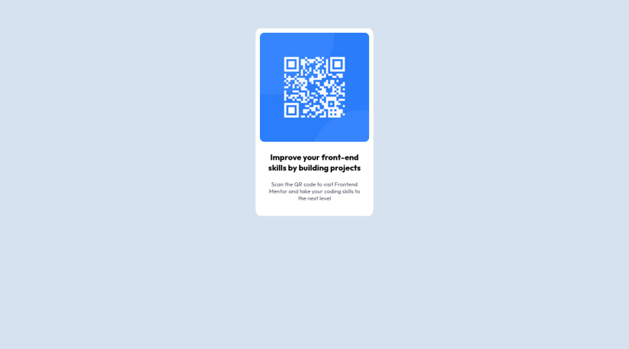
Alt text πŸ“·:

  • The alt attribute should explain the purpose of the image. Uppon scanning the QR code, the user will be redirected to the frontendmentor.io website, so a better alt attribute would be QR code to frontendmentor.io

    If you want to learn more about the alt attribute, you can read this article. πŸ“˜.

I hope you find it useful! πŸ˜„

Happy coding!

0
Hassia Issahβ€’ 50,690

@Hassiai

Posted

Replace <div class="container"> with the main tag and <h3> with <h1> to fix the accessibility issue. click here for more on web-accessibility and semantic html

To center .container on the page using flexbox, add min-height:100vh; display: flex; align-items: center: justify-content: center; to the body.

To center .container on the page using flexbox:
body{
min-height: 100vh;
display: flex;
align-items: center;
justify-content: center;
}

Replace the height in .container with a padding value for all the sides, this will prevent the content from overflowing on smaller screens and its a responsive replacement. padding:15px .

Give the img a max-width of 100% instead of a fixed width and height value. There is no need to give the img margin values.

Give h1 and p the same font-size of 15px and the same margin-left, margin-right and margin-top values. Give p a margin bottom value.

Use relative units like rem or em as unit for the padding, margin, width values and preferably rem for the font-size values, instead of using px which is an absolute unit. For more on CSS units Click here

Hope am helpful.

Well done for completing this challenge. HAPPY CODING

0

Please log in to post a comment

Log in with GitHub
Discord logo

Join our Discord community

Join thousands of Frontend Mentor community members taking the challenges, sharing resources, helping each other, and chatting about all things front-end!

Join our Discord