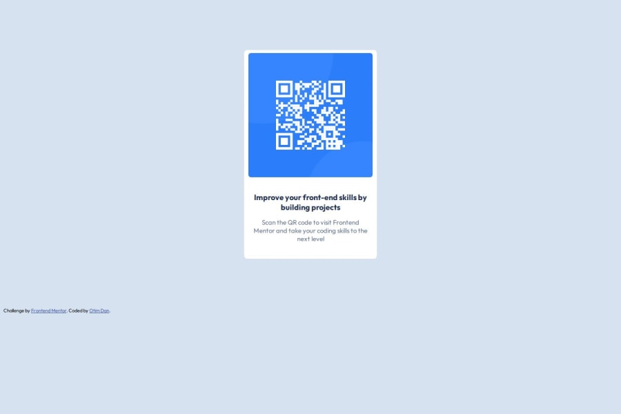
Design comparison
Solution retrospective
I happy to have implemented the website without doing any copy and paste from existing solutions but purely my own knowledge of HTML and CSS
What challenges did you encounter, and how did you overcome them?I took me a while to figure this yet it looks so simple. I encountered challenges on working with the box model i.e padding, margins to fit the original design.
What specific areas of your project would you like help with?I would like help on how I would have approached it better, or in a more efficient way on the side of CSS
Community feedback
- P@huyphan2210Posted 6 months ago
Hi, @otimdan,
I took a look at your solution and wanted to share some thoughts:
- Your
.cardisn’t centered on the page because thebodydoesn’t fill the entire viewport. The viewport is the visible area of the web page. To ensure thebodyoccupies the full height of the viewport, you should applymin-height: 100vhto thebody. This is a good practice because it guarantees that your layout will be responsive and adapt well to different screen sizes. You can also make thebodya flexbox to center your.containerlike this:
body { min-height: 100vh; display: flex; justify-content: center; align-items: center; }- Additionally, consider using semantic HTML elements instead of relying solely on
<div>. Semantic elements, like<header>,<footer>, and<main>, provide meaning to the structure of your document and improve accessibility, making it easier for both developers and search engines to understand the content.
Let me know if you have any questions! Hope this helps!
Marked as helpful0@otimdanPosted 6 months ago@huyphan2210 Thank you for the feedback, I'll edit my code and read more on viewports and better HTML semantic elements.
1 - Your
Please log in to post a comment
Log in with GitHubJoin our Discord community
Join thousands of Frontend Mentor community members taking the challenges, sharing resources, helping each other, and chatting about all things front-end!
Join our Discord
