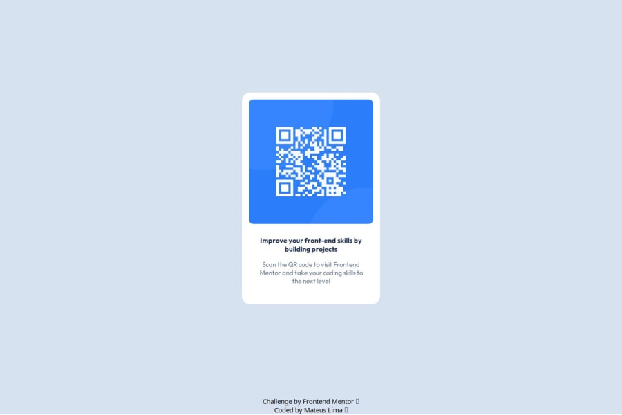
Design comparison
Solution retrospective
Still need more practice to be proud/have doubts.
What challenges did you encounter, and how did you overcome them?Despite this being a simple project, i still had no idea how to begin, i actually looked at the blank page for some time before the idea came to me.
What specific areas of your project would you like help with?I actually want to know if it's common to use rem instead os px, i usually set up the css like: :root { font-size: 62.5%; } So, instead of 10px i use .1rem. I saw a guy explaining that it's better for the user. Is it really?
Note: English is not my native language.
Community feedback
- @py-code314Posted 8 months ago
Hi,
Your project looks good! But the title text looks a little smaller than the specifications to me.
You can read this article about why you always want to use
remforfont-size. Also this one for why you don't want to setfont-size: 62.5%onbodyelementHope these articles will help you make a decision. All the best!!
Marked as helpful0
Please log in to post a comment
Log in with GitHubJoin our Discord community
Join thousands of Frontend Mentor community members taking the challenges, sharing resources, helping each other, and chatting about all things front-end!
Join our Discord
