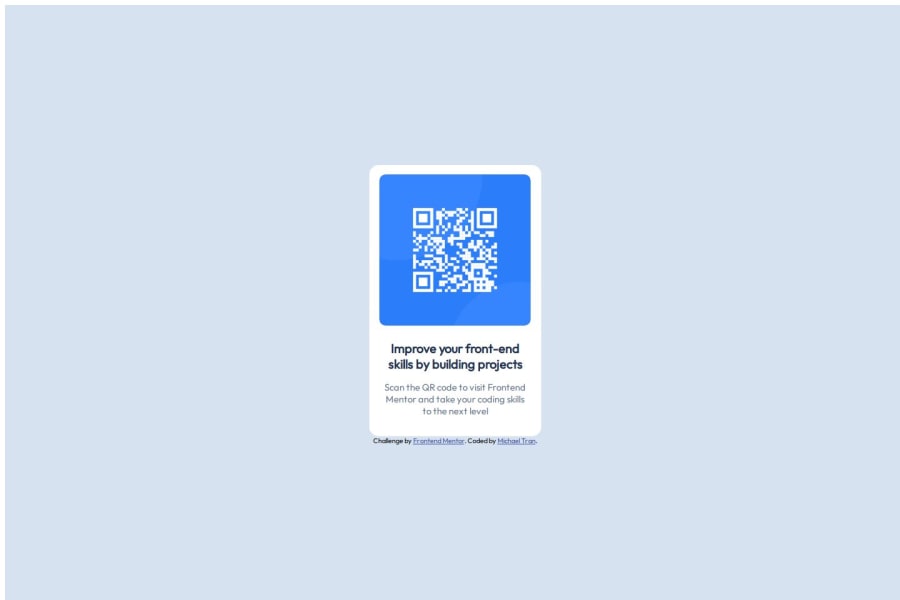


Design comparison

Solution retrospective
I am the most proud of the fact that I was able to figure out mostly everything without the help of the internet while doing the project. I learned HTML and CSS shortly before taking on this project and I was able to remember how to format everything except for corner rounding (which I hadn't learned). Next time I would like to make it more friendly to other resolutions instead of keeping it at one fixed size the entire time. I believe it was okay for this project since the card was so small but in the future this would not work.
What challenges did you encounter, and how did you overcome them?One of the challenges that I faced was centering the "sub" div which held the subsection of my header. I went through many padding, margin, justification and alignment changes before I figured out that it was a simple naming problem. I changed my div name from to and the padding started working as I intended for it to.
What specific areas of your project would you like help with?I would like help with the div background sizing and if I am centering the divs correctly using justification and alignment. I used %s for div sizing and I am wondering if this is correct usage.
Community feedback
- @IonCatanaPosted 4 months ago
Hi michaeltran9224, i like to give you some feedback!
HTML Structure Meta Tags:
Strength: The inclusion of <meta name="viewport"> ensures the site is responsive. Improvement: Add a description meta tag for better SEO.
Typography:
Strength: Custom Google Font (Outfit) is included. Improvement: Use fallback fonts in case the primary font fails to load (e.g., font-family: 'Outfit', sans-serif).
Accessibility: Add alt attributes to all images to improve screen reader compatibility. Ensure the <title> is descriptive and relevant.
Semantics: Use semantic HTML elements like <main>, <section>, or <article> to enhance readability and accessibility.
CSS Styling Responsiveness:
Strength: The design uses percentages for dimensions, which is good for responsiveness. Improvement: Include media queries to ensure proper display on smaller screens, especially for the .container width and height.
Consistency: Use a CSS reset or normalize file to standardize styles across different browsers.
Color Palette: Strength: Consistent use of colors defined in HSL values. Improvement: Extract the color palette into CSS variables for easier management and reusability (e.g., --primary-color: hsl(218, 44%, 22%);).
Box Sizing: Include box-sizing: border-box; for all elements to simplify size calculations. General Improvements
File Organization: Consider moving style.css into a styles directory for better structure. Organize images into categories within the images folder if the project scales.
Performance: Optimize image files in the images folder to reduce load times.
Div Background Sizing Using % for Sizing: Using percentages (%) for width and height is appropriate when creating responsive layouts. Percentages are relative to the size of the parent container, which can make your layout adapt to different screen sizes.
Best Practices: Ensure the parent container has a defined size; otherwise, percentage-based sizing might behave unexpectedly. Combine % with max-width, max-height, or min-width to set constraints and prevent elements from becoming too large or too small.
Alternative Units: For sizes relative to the viewport, use vw (viewport width) and vh (viewport height). For example: width: 80vw; /* 80% of the viewport width / height: 50vh; / 50% of the viewport height */
Centering Divs with Flexbox Justification and Alignment:
When centering a div using justify-content and align-items, ensure the parent container has display: flex or display: grid set.
Example for full-page centering: display: flex; justify-content: center; /* Centers horizontally / align-items: center; / Centers vertically / height: 100vh; / Full viewport height */
Tips:
Use browser dev tools to inspect and debug the alignment. Add temporary borders (border: 1px solid red;) to visualize spacing and alignment issues. Combining Background and Centering:
If the background of the div is also important, ensure the container with the background has: Proper background-size (e.g., cover, contain) for responsiveness. Correct dimensions (e.g., width: 100%; height: 100vh; for full-page backgrounds).
0

Please log in to post a comment
Log in with GitHub
Join our Discord community
Join thousands of Frontend Mentor community members taking the challenges, sharing resources, helping each other, and chatting about all things front-end!
Join our Discord