Design comparison
SolutionDesign
Community feedback
- @bmeinert8Posted about 2 months ago
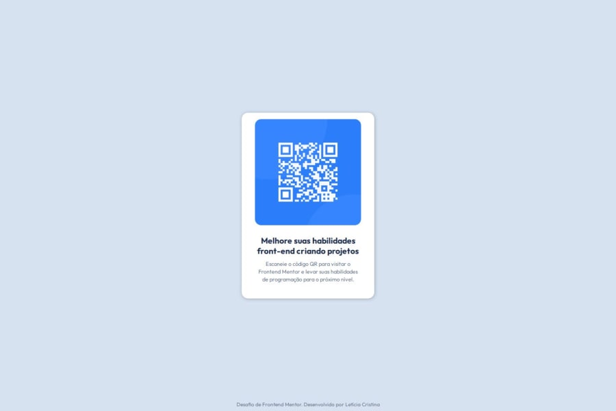
You're very close to the design! What I notice is your margins are a little too wide between the image and the edge of the container. Try reducing and or removing the left and right padding. Otherwise, good job!
0
Please log in to post a comment
Log in with GitHubJoin our Discord community
Join thousands of Frontend Mentor community members taking the challenges, sharing resources, helping each other, and chatting about all things front-end!
Join our Discord
