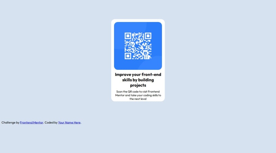
Design comparison
SolutionDesign
Solution retrospective
The sizing and positioning were the hardest to get right, is there and easy way of doing this?
Community feedback
- @MariusG1991Posted 9 months ago
Hi,
For positioning the easy way is to use flexbox. Instead of using margin in container to positioning, just set
min-height:100vhin your body selector so height of this element is equal to 100% of the viewport height and then also in your body selector add:display: flex; justify-content: center; // This three will center your component in the middle of the screen align-items: center;Marked as helpful0 - @danielmrz-devPosted 9 months ago
Hello @Ahmedq02!
Your project looks great!
- Using
marginis not the best option to center an element. Here's a very efficient (and better) way to place an element in the middle of the page both vertically and horizontally:
📌 Apply this to the body (in order to work properly, don't use position or margins):
body {
    min-height: 100vh;
    display: flex;  /* it works with grid too  */
    justify-content: center;
    align-items: center;
}
I hope it helps!
Other than that, great job!
Marked as helpful0 - Using
Please log in to post a comment
Log in with GitHubJoin our Discord community
Join thousands of Frontend Mentor community members taking the challenges, sharing resources, helping each other, and chatting about all things front-end!
Join our Discord
