

Design comparison
SolutionDesign

Solution retrospective
What are you most proud of, and what would you do differently next time?
all feedback are welcome thank you!!
Community feedback
- @FoPiPosted 3 months ago
++Nice to have a separated style.css ++Good job with the color variables.
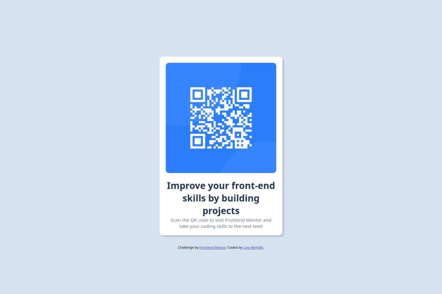
The solution has some difference from the design:
- Everything is bigger on both desktop and mobile.
- container
- fonts
- image
- Border radius is also different.
- Font won't load for me. Try using the code provided by Google Fonts.
If the font get fixed it will be much better.
0

Please log in to post a comment
Log in with GitHubJoin our Discord community
Join thousands of Frontend Mentor community members taking the challenges, sharing resources, helping each other, and chatting about all things front-end!
Join our Discord