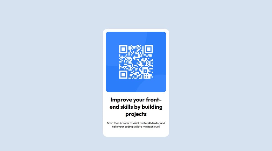
Design comparison
Solution retrospective
While not able to 100% replicate the project, I am happy with the dimensions and everything that I got.
What challenges did you encounter, and how did you overcome them?I have gotten accustomed to the idea of margin, padding and adding custom languages to my projects. Definitely helped!
Community feedback
- @danielmrz-devPosted 7 months ago
Hello, @sippuuu!
Your project is looking fantastic!
I'd like to suggest a way to make it even better:
- Using
margin
isn't always the most effective method for centering an element.
Here's a highly efficient approach to position an element at the center of the page both vertically and horizontally:
š Apply this CSS to the body (avoid using
position
ormargins
in order to work correctly):body { min-height: 100vh; display: flex; justify-content: center; align-items: center; }
I hope you find this helpful!
Keep up the excellent work!
Marked as helpful1@mihainrsPosted 7 months agoHey @danielmrz-dev !
Thank you so much for pointing it out.
To be honest with you, since I also got a Figma design file alongside the challenge files and all, I tried to accurately replicate the dimensions presented in the preview/example, which has definitely led me to tunnel vision onto margins and paddings haha.
Given how I'm still figuring out the workflow and good practices for properly building projects from the ground up, this info will definitely come in handy.
Thank you!
1 - Using
Please log in to post a comment
Log in with GitHubJoin our Discord community
Join thousands of Frontend Mentor community members taking the challenges, sharing resources, helping each other, and chatting about all things front-end!
Join our Discord