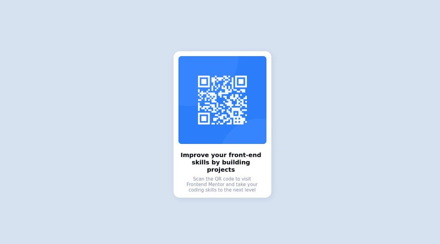
Design comparison
SolutionDesign
Solution retrospective
First attempt at a frontend mentor problem, was surprisingly a little more difficult getting it to be as close as the original. I think it was mostly difficult due to being so rusty on HTML and CSS. Any feedback is much appreciated!
Community feedback
- @Bader-IdrisPosted over 1 year ago
You can set the container in the middle of the screen whatever user changes it when you add these properties to it in CSS:
.container {
  display: absolute;
  top:50%;
  left: 50%;
  transform: translate(-50%, -50%);
}
the new feature is transform, it has many lovely properties you can discover, I personally love it. Hope it's useful
Marked as helpful2 - @AlvinSetyaPranataPosted over 1 year ago
I think the font is too big and you should use
max-widthproperty to reduce it's sizeMy solution would be like:
h2 {
        font-size: 20px;
        font-weight: 700;
        max-width: 270px;
        text-align: center;
      }

      p {
        font-size: 15px;
        font-weight: 400;
        color: var(--grayish-blue);
        max-width: 250px;
        text-align: center;
      }
Marked as helpful1
Please log in to post a comment
Log in with GitHubJoin our Discord community
Join thousands of Frontend Mentor community members taking the challenges, sharing resources, helping each other, and chatting about all things front-end!
Join our Discord
