Design comparison
Solution retrospective
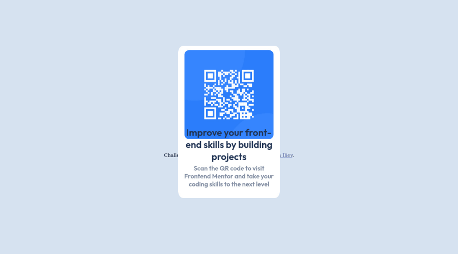
I have found difficult with making the font as per the requested. I am unsure of the dimensions of the card. I will be more than happy if someone explains to me how to arrange the dimensions as well as id fonts.
Community feedback
- @FloratobyDevPosted almost 2 years ago
- Learn about
flexbox
and any other display values. It will make aligning so much easier for you. Here's an example:
HTML:
<!DOCTYPE html> <html lang="en"> <head> <meta charset="UTF-8"> <meta name="viewport" content="width=device-width, initial-scale=1.0"> <link rel="icon" type="image/png" sizes="32x32" href="./images/favicon-32x32.png"> <link rel="stylesheet" href="css/style.css"> <title>Frontend Mentor | QR code component</title> </head> <body> <div class="white-square"> <img src="images/image-qr-code.png" alt="qr-code-component-main"> <h1 id="content">Improve your front-end skills by building projects</h1> <p id="grey-text">Scan the QR code to visit Frontend Mentor and take your coding skills to the next level</p> </div> </body> </html>
CSS :
@import url('https://fonts.googleapis.com/css2?family=Outfit:wght@400;700&display=swap'); * { box-sizing: border-box; margin: 0; padding: 0; } img{ width: 90%; height: auto; border-radius: 5%; padding-top: 3vh; } .white-square{ width: 40vh; background-color: white; padding: 1rem 0px 2rem; border-radius: 15px; font-size: 30px; display: flex; flex-direction: column; align-items: center; justify-content: center; text-align: center; gap: 20px; } body{ display: flex; align-items: center; justify-content: center; height: 100vh; width: 100%; background-color: rgb(148, 148, 192); max-width: 1440px ; background-color: hsl(212, 45%, 89%); } #content{ font-family: 'Outfit', sans-serif; font-weight: 700; font-size: 1.3rem; width: 85%; color: hsl(218, 44%, 22%); } #grey-text{ width: 80%; color: hsl(220, 15%, 55%); font-family: 'Outfit', sans-serif; font-size: .9rem; font-weight: 400; }
If you're wondering about this :
* { box-sizing: border-box; margin: 0; padding: 0; }
It'll make your styling life easier if you add this. It basically eliminates all the default margin and padding of each elements so you can get a better control of how you want to pad and margin your elements. The
box-sizing: border-box
is use to keep the dimensions of an element from expanding any further than you have define them to be. For example, if you setwidth: 200px
, then that is all it's going to be even if you change the padding or margin. It will not affect the width of the element at all. It is a very popular practice due to that.Marked as helpful0 - Learn about
- @FloratobyDevPosted almost 2 years ago
- How absolute and relative position works in terms of its effect on the width and height of a container. A
relative position
can still affect the width and height of a container like div. Anabsolute position
does not affect the width and height of a container and can go wherever in the screen unless its parent has the relative position property. If so, then it can only move around that parent's container.
Here's an example of setting an element inside a container to
absolute
:
| element one | element two |
Think this two elements are stored in a container. The width of that container is affected by the widht of both elements. If you set
element two
to position absolute, then the width of that element will not affect the container's width anymore like so:
| element one |
Instead, it will be on top of
element one
. I can't draw that here but just imagine it being on top ofelement one
. Any element inside a container with an absolute position, will always be initially positioned as the first element of that container.Hope that's good enough to describe the difference.
Marked as helpful0 - How absolute and relative position works in terms of its effect on the width and height of a container. A
- @FloratobyDevPosted almost 2 years ago
- HTML structure is essential when it comes to styling your website. It can easily make your life miserable if you don't properly think of how your structure is going to affect your styling later on. Your current HTML structure is pretty difficult to work on because you separated them into containers. A container is an element like div, main, section, etc. where you can put a bunch of elements together and use that to align them or execute a group styling on them. You should always group elements together if you're trying to align them together properly. Also, if you just want to store a text in an element, it's better to just use a <p> element or other elements that is meant to store a text content. Trust me, it'll make structuring much easier.
Here's how I restructured your code:
<body> <div class="white-square"> <img src="images/image-qr-code.png" alt="qr-code-component-main"> <h1 id="content">Improve your front-end skills by building projects</h1> <p id="grey-text">Scan the QR code to visit Frontend Mentor and take your coding skills to the next level</p> </div> </body>
Here's also another structure where it's good enough :
<div class="white-square"> <div class="blue-square"> <img src="images/image-qr-code.png" alt="qr-code-component-main"> </div> <div id="content"> Improve your front-end skills by building projects</div> <div id="grey-text">Scan the QR code to visit Frontend Mentor and take your coding skills to the next level</div> </div>
I simply took out the <br> element. Leave it to the styling to do the spacing for you. And the element I also took out. Since there's nothing in the div element but the text, this works just fine. This is all fine for starters but in the long run, make sure to learn more about different elements and how they're being use.
Marked as helpful0@DeyanIlievPosted almost 2 years ago@FloratobyDev Thank you so much for the feedback! I appreciate it and I will look more carefully next time. Thank you for pointing out about the structure of the HTML and how it works!
0 - @FloratobyDevPosted almost 2 years ago
- Please don't use import and inside a body element. If you want to import your fonts, either copy-paste the link URL from Google Fonts and paste them in the <head></head> element or take your import URL and put them on top of your
.css
file. Note that the files you import inside a.css
file only work for that specific file. However, the other method is going to work globally which means you can use it wherever you have multiple.css
files.
Here's an example:
@import url('https://fonts.googleapis.com/css2?family=Outfit:wght@400;700&display=swap'); img{ position: relative; width: 100%; height: auto; border-radius: 15px; /* margin: auto; */ /*padding-left: 5vh; padding-top: 3vh;*/ /* display: block; */ /* transform: translateY(5%); */ }
or
<head> <meta charset="UTF-8"> <meta name="viewport" content="width=device-width, initial-scale=1.0"> <link rel="icon" type="image/png" sizes="32x32" href="./images/favicon-32x32.png"> <link rel="stylesheet" href="css/style.css"> <link rel="preconnect" href="https://fonts.googleapis.com"> <link rel="preconnect" href="https://fonts.gstatic.com" crossorigin> <link href="https://fonts.googleapis.com/css2?family=Outfit:wght@400;700&display=swap" rel="stylesheet"> <title>Frontend Mentor | QR code component</title> </head>
Marked as helpful0@DeyanIlievPosted almost 2 years ago@FloratobyDev Thank you! In my other solution I have fixed it as well as other issues.
0 - Please don't use import and inside a body element. If you want to import your fonts, either copy-paste the link URL from Google Fonts and paste them in the <head></head> element or take your import URL and put them on top of your
Please log in to post a comment
Log in with GitHubJoin our Discord community
Join thousands of Frontend Mentor community members taking the challenges, sharing resources, helping each other, and chatting about all things front-end!
Join our Discord