Not Found
Not Found
Not Found
Not Found
Not Found
Not Found
Not Found
Not Found
Not Found
Not Found
Request failed with status code 502
Not Found
Not Found
Not Found
Not Found
Not Found
Not Found
Not Found
Not Found
Not Found

Submitted

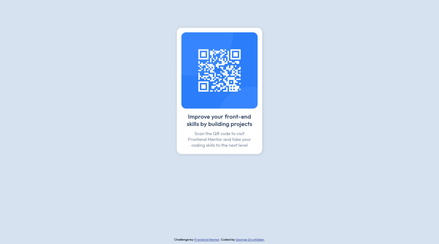
QR Code Mock Up (HTML/CSS)

@GitGrunfelder

Desktop design screenshot for the QR code component coding challenge

This is a solution for...

  • HTML
  • CSS
1newbie
View challenge

Design comparison


SolutionDesign

Solution retrospective


Were we supposed to include that offwhite/funky background? Was how I centered the card correct? How could I improve?

Community feedback

Adrianoβ€’ 34,000

@AdrianoEscarabote

Posted

Hi George Grunfelder, how are you? Welcome to the front-end mentor community! I really liked the result of your project, but I have some tips that I think you will enjoy:

A good practice to center content is using grid or flex-box, avoid using margin or padding to make placements, use only in the latter case! we can do it like this:

Flex-box:

body {
    display: flex;
    align-items: center;
    justify-content: center;
    flex-direction: column; // just if the body has two child
    min height: 100vh;
}

GRID

body {
    display: grid;
    min height: 100vh;
    place-content: center;
}

The rest is great!

I hope it helps... πŸ‘

0

@VCarames

Posted

Hey there! πŸ‘‹ Here are some suggestions to help improve your code:

Regarding you question,

Nope. It just to show off the project in a presentable manner.

  • To properly center your content to your page, you will want to add the following to your body element (this method uses CSS Grid):
body {
    min-height: 100vh;
    display: grid;
    place-content: center;
}

More Info:πŸ“š

Centering in CSS

  • To not only improve your HTML code but to also identify the main content of you page, you will want to wrap your entire component inside the main element.

More Info:πŸ“š

MDN Main Element

  • Change width to max-width in your component’s container to make it responsive. You will also want to remove the height as it is unnecessary.
  • The alt tag description for the β€œQR image” needs to be improved upon. Its needs to tell screen reader users what it is and where it will take them to when they scan it.
  • The "Improve your front-end skill by building projects" is a heading in this component, so should be wrapped in an heading element.

If you have any questions or need further clarification, feel free to reach out to me.

Happy Coding! πŸ‚πŸ¦ƒ

0

Please log in to post a comment

Log in with GitHub
Discord logo

Join our Discord community

Join thousands of Frontend Mentor community members taking the challenges, sharing resources, helping each other, and chatting about all things front-end!

Join our Discord