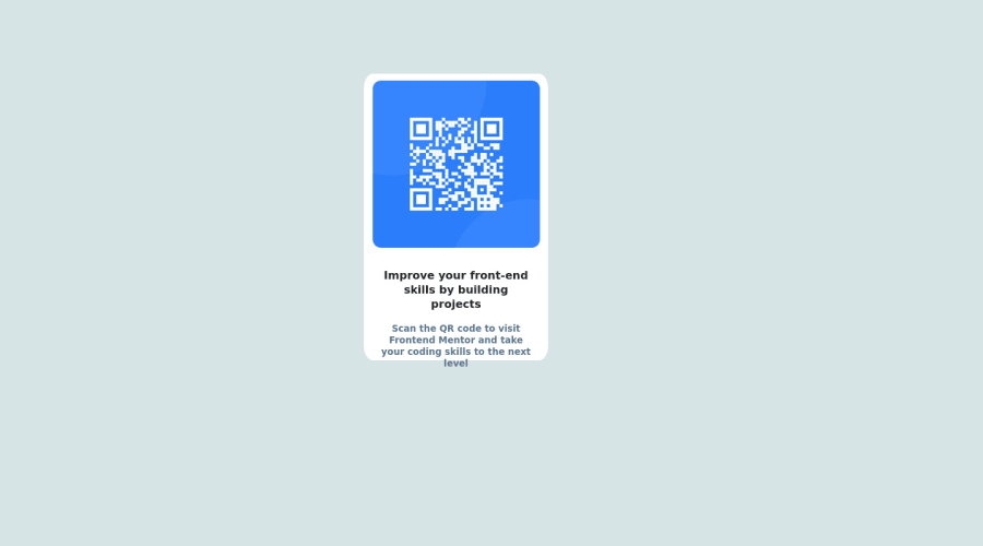
Design comparison
Solution retrospective
- What did you find difficult while building the project?
- Which areas of your code are you unsure of?
=> Areas where I felt difficult to build is to make the website view same as on desktop as well as mobile. Still I am not able to figure out how to get the desired look on Mobile devices.
Community feedback
- @Tux3er-IsmaPosted almost 2 years ago
Hi Tanmay!!!
Congrats completing this challenge ππ»
When I was starting I found also difficult to pass from desktop to mobile
- In css there is a property called media-querie. The structure is like this:
@media only screen and (max-width: Xpx){}
.`
In this case we are using 375px because is a mobile. This is the documentation with exercices, documentation π
- Don't use
position
to center elements. There is a easy way to center elements nowadays widt css flexbox:.main_body{ min-height: 100vh; display: flex; justify-content: center; align-items: center;
video about flexbox πΉ
You have done it very well, congrats πππ»π
I hope this comment will help you in the future building awesome projects π
1 - In css there is a property called media-querie. The structure is like this:
- @MelvinAguilarPosted almost 2 years ago
Hello there π. Good job on completing the challenge !
I have some suggestions about your code that might interest you.
Mobile view π±:
-
The
viewport
meta tag is missing. theviewport
meta tag is used to control the layout of the page on mobile devices. Add theviewport
meta tag to the<head>
tag:<meta name="viewport" content="width=device-width, initial-scale=1.0">
If you delete the viewport meta tag, the browser will use its default settings for the viewport, which may not be appropriate for the web page you are trying to display. This can lead to issues with the layout of the page, particularly on mobile devices where the screen size and resolution can vary greatly. The page could be too small to read.
HTML π:
- The
lang
attribute is used to declare the language of the webpage. Add thelang
attribute to the<html>
tag with the valueen
.
- Wrap the page's whole main content in the
<main>
tag.
- It is not valid to enclose a heading element (<h5>, <h4>, etc..) within a paragraph, you can confirm this here: https://caninclude.glitch.me/caninclude?child=h5&parent=p
- Always avoid skipping heading levels; Starting with <h1> and working your way down the heading levels (<h2>, <h3>, etc.) helps ensure that your document has a clear and consistent hierarchy. Source π
- The text
Improve Your Front-End Skills by Building Projects
is considered a heading element (h1).
CSS π¨:
- To center the component in the page, you should use Flexbox or Grid layout. You can read more about centering in CSS here π.
body { background-color: #D6E4E5; min-height: 100vh; display: grid; place-content: center; } .main_body { /* position: relative; */ /* top: 100px; */ /* left: 525px; */ . . . }
CSS Reset π:
-
You should use a CSS reset. A CSS reset is a set of CSS rules that are applied to a webpage in order to remove the default styling of different browsers.
CSS resets that are widely used:
I hope you find it useful! π Above all, the solution you submitted is great!
Happy coding!
1 -
- @garcialexcoPosted almost 2 years ago
Hello! Great job completing the challenge! π₯
There's a couple parts of your code that I might be able to help with:
- Easiest way to center a thing in the middle of the page is:
position: absolute; top: 50%; left: 50%; transform: translate(-50%, -50%);
- Stick to using responsive units that resize with the page such as
em
,rem
, percentages etc. They are a lot more forgiving and not as exact as pixels when making it responsive!
Hope this helps, and keep up the great work! π Happy Coding!
0@codeminexPosted almost 2 years ago@garcialexco Thanks for your valuable feedback. Surely, I will implement the suggestions given by you. Stay connected !! Thankyou.
1
Please log in to post a comment
Log in with GitHubJoin our Discord community
Join thousands of Frontend Mentor community members taking the challenges, sharing resources, helping each other, and chatting about all things front-end!
Join our Discord