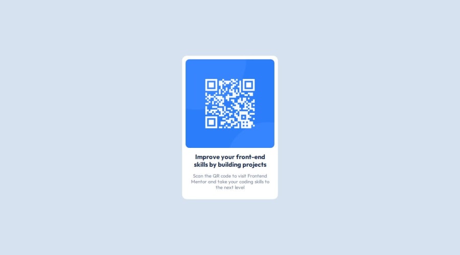
Design comparison
Solution retrospective
I did this challenge with relatively very less errors and that too on my own.
What challenges did you encounter, and how did you overcome them?Trouble in centering the divs in html body. Having width from 100% to 100vh helped solve the problem.
What specific areas of your project would you like help with?Adjusting more than two rows in a div.
Community feedback
- @fayiz770Posted 10 months ago
** Congratulations on completing this challenge ** Yon needs help adjusting more than two rows in a div. you can achieve this in multiple ways one is placing two divs inside the main div and displaying that flexibility. like this ** HTML **
<div class="main-div">
<div class="first-div"></div>
<div class="second-div"></div>
</div> ```

** CSS **
.main-div {
display: flex;
flex-direction: row;
}


I hope this helps you.

If you find this useful, please mark it as helpful.

thanks
0 - @svo15Posted 10 months ago
with this name code i understand what mistakes i was doing and will fix it
0
Please log in to post a comment
Log in with GitHubJoin our Discord community
Join thousands of Frontend Mentor community members taking the challenges, sharing resources, helping each other, and chatting about all things front-end!
Join our Discord
