Not Found
Not Found
Not Found
Not Found
Not Found
Not Found
Not Found
Not Found
Not Found
Not Found
Not Found
Not Found
Not Found
Not Found
Not Found
Not Found
Not Found
Not Found
Not Found
Not Found

Submitted

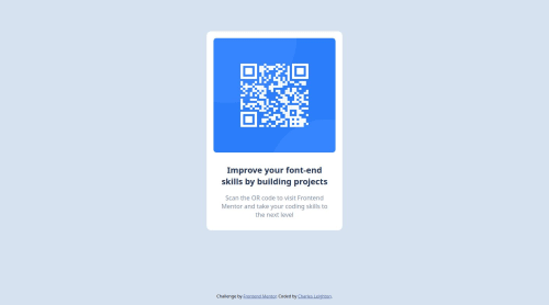
QR Code Landing Page

P
Charlesā€¢ 110

@chleighton1

Desktop design screenshot for the QR code component coding challenge

This is a solution for...

  • HTML
  • CSS
1newbie
View challenge

Design comparison


SolutionDesign

Solution retrospective


This was a pretty simple project but good practice to re-enforce my knowledge of flex and mobile design. I am going to start developing projects using a framework such as Next.js rather than just HTML and CSS.

Community feedback

Daniel šŸ›øā€¢ 44,230

@danielmrz-dev

Posted

Hello @chleighton1!

Your solution looks great!

I have a couple of suggestions (about semantic HTML) for improvement:

šŸ“Œ First: Use <main> to wrap the main content instead of <div>.

Tags like <div> and <span> are typical examples of non-semantic HTML elements. They serve only as content holders but give no indication as to what type of content they contain or what role that content plays on the page.

šŸ“Œ Second: Use <h1> for the main title instead of <h2>.

Unlike what most people think, it's not just about the size and weight of the text.

  • The <h1> to <h6> tags are used to define HTML headings.

  • <h1> defines the most important heading.

  • <h6> defines the least important heading.

  • Only use one <h1> per page - this should represent the main heading/title for the whole page. And don't skip heading levels - start with <h1>, then use <h2>, and so on.

All these tag changes may have little or any visual impact but they make your HTML code more semantic and improve SEO optimization as well as the accessibility of your project.

I hope it helps!

Other than that, great job!

Marked as helpful

2
P
solvmanā€¢ 1,670

@solvman

Posted

Very well done! šŸŽŠšŸŽ‰šŸš€

I have a few suggestions for you:

  • ā­ļø First, the <main> element represents the primary content of the document and expands on the central topic of the document. You should wrap your content in <main>. Such widgets as cards are more suited to be constructed with the <article> element, which encapsulates reusable, self-contained content.
  • ā­ļø Titles and headings are usually denoted by <h1>, <h2>, <h3>, and so on. Do not skip levels of headings. Regular text is generally encapsulated by <p>. A card-like widget's most appropriate heading level is likely <h2>. Great job!

With that being said, I would redo your code as so:

<body>
  <main id="container">
    <h1 class="visually-hidden">Frontend Mentor project submission</h1>
    <article class="card">
      <img src="./images/image-qr-code.png" alt="QR Code">
      <h2>Improve your front-end skills by building projects</h3>
      <p>Scan the QR code to visit Frontend Mentor and take your coding skills to the next level</p>
    </article>
  </main>
  <footer class="attribution">
      ... attribution goes here
  </footer>
</body>

As mentioned above, the <h2> heading is the most appropriate for the card-like widget. To avoid breaking hierarchy heading rules, I added an invisible <h1> heading to announce "Frontend mentor project submission" to accessibility users. Visually hidden class (something it is called sr-only which is "screen reader only") for the <h1> :

.visually-hidden {
  position: absolute;
  width: 1px;
  height: 1px;
  padding: 0;
  margin: -1px;
  overflow: hidden;
  clip: rect(0, 0, 0, 0);
  white-space: nowrap;
  border: 0;
}

Learn more about semantic HTML elements here

You don't need a Flex column for your card. Please remember that block-level elements stack one on top of the other. The only element not block level within the card is <img>, which could be "converted" to block level through a simple reset, which should be used almost on every project anyway. Refrain from hard-setting image sizes; it will make them not responsive to layout changes:

img {
    display: block;
    max-width: 100%;   /* ensures images does not overflow the container */
}
  • ā­ļø I noticed that you use Flex to set your card in the middle of the screen. Great job! It is an appropriate and excellent choice. There is also a Grid option. I prefer the latter since it is only a line shorter:
body {
    min-height: 100vh;
    display: grid;
    place-content: center;
}
  • ā­ļø Consider using REM units for margin, padding, and font size.

Otherwise, very well done!šŸŽŠ Keep it up!šŸ‘ I hope you find my comments useful šŸ«

Marked as helpful

2

P
Charlesā€¢ 110

@chleighton1

Posted

Hi @solvman thank you for all the feedback! This is very useful and I really appreciate it.

One question I have is how would you put the footer(attribution) at the bottom of the page if you were to set the card in the middle of the screen with Grid? Margin bottom set to auto does not seem to work for this.

1
P
solvmanā€¢ 1,670

@solvman

Posted

@chleighton1

I'm glad it was useful to you! You must create two separate rows to move the footer to the bottom. I have created a pull request for your GitHub repository. You may choose to accept the changes and merge them to your repo, or you could do this by changing your code as follows:

/* Reset */
* {
  box-sizing: border-box;
  margin: 0;
  padding: 0;
}

body {
  background-color: hsl(212, 45%, 89%);
  font-family: sans-serif;
  min-height: 100vh;
  display: grid;
  grid-template-rows: minmax(min-content, 1fr) min-content;
  align-items: center;
  justify-content: center;
}

Add the top margin in addition to the bottom margin:


.attribution {
  font-size: 11px;
  text-align: center;
  margin-block: 1rem;
}

There is a great site to learn grid through playing the game: Play Grid Attack. I found it very entertaining.

I hope you find my comments useful šŸ«

Marked as helpful

1
P
Charlesā€¢ 110

@chleighton1

Posted

@solvman Thank you so much, this is very helpful!

Also I am loving Play Grid Attack, thank you so much for sharing. I feel pretty comfortable with Flex but can definitely use the practice on Grid so I will be playing this a lot! šŸ˜Š

1
P
Mihai Chirilovā€¢ 140

@MihaiChirilov

Posted

Hello,

I really like your solution to this project. Great job! The only thing I have noticed other than the comments above, is that you should use the custom font suggested in the design (Outfit). For example I have used the @import at the top of my css file like this: @import url('https://fonts.googleapis.com/css2?family=Outfit:[email protected]&display=swap');

And then I have used font-family: "Outfit", sans-serif;

This way your solution will be closer to the original design proposal.

Thank you, Michael

Marked as helpful

0

Please log in to post a comment

Log in with GitHub
Discord logo

Join our Discord community

Join thousands of Frontend Mentor community members taking the challenges, sharing resources, helping each other, and chatting about all things front-end!

Join our Discord