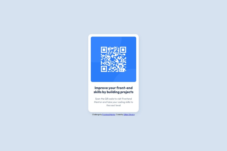
QR Code Invitation Component Built with Semantic HTML5 and CSS Flexbox
Design comparison
Solution retrospective
It was very nice to center the card without using margin: 0 auto. Before starting a new project, I will look through all available resources before developing a solution, instead of relying only on the Figma files.
What challenges did you encounter, and how did you overcome them?The biggest challenge for me was the card shadow. I tried CSS documentation and some tutorials to understand how it works, but it only looked right after ChatGPT helped me get the transparency value that matched the example card.
What specific areas of your project would you like help with?I've been researching accessibility, and I would really like to find materials created by people who use screen readers or have altered color perception. I’d also like to know how to test a page to ensure it meets accessibility requirements.
Community feedback
- @UnifiesPosted 5 months ago
Hey Gillian, you've done an amazing work on this challenge. Your solution looks excellent, your code structure superb, and your approach to the solution [researching additional helpful resources before embarking on the challenge] intelligent - overall, Kudos! You nailed it.
A teeny update on the design - add some weight to the title's font, instead of normal font-weight, use instead
font-weight: 700;to make the title bolder as is in the design.Some code optimization suggestions for your CSS:-
For the challenges on here, it is probably not needed but using colors, font-weights, sizes etc. as variables would be a good practice. Like:
:root {
    /* Colors */
    --White: hsl(0, 0%, 100%);
    --Slate-300: hsl(212, 45%, 89%);
    --Slate-500: hsl(216, 15%, 48%);
    --Slate-900: hsl(218, 44%, 22%);
    --attribution: hsl(228, 45%, 44%);
    /* Fonts */
    --fs-h1: 1rem;
    --fs-p: 0.85rem;
    --fw-400: 400;
    --fw-700: 700;
}
and then you can use them for styling like
font-weight: var(--fw-700);.Reason being: These things may change in a real project, so when it does all you have to do is change them from the root instead of searching in the whole css file/s.
Avoid using hard coded values, like
width: 320px;use insteadmax-width: 320px;or even better; use equivalent rem/em values instead for better responsiveness on all screen sizes.For accessibility, add an alt text to the QR Code Image - Imgs need to have meaningful alt text, except for the decorative imgs - as it is greatly useful to users who rely on screen readers.
That's all from me - PS: let a pal know if you find a good resource that explains accessibility's best practices, I'm also on the lookout for one.
Wish you luck, Happy coding!
Marked as helpful1
Please log in to post a comment
Log in with GitHubJoin our Discord community
Join thousands of Frontend Mentor community members taking the challenges, sharing resources, helping each other, and chatting about all things front-end!
Join our Discord
