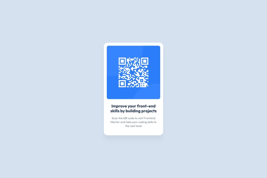
Design comparison
Solution retrospective
QR Do give me your valuable feedback on how to improve.This will help me improve my frontend skills.I will post more projects in the future
Community feedback
- @MelvinAguilarPosted almost 2 years ago
Hello there 👋. Good job on completing the challenge !
I have some suggestions about your code that might interest you.
Alt text 📷:
-
The
altattribute should explain the purpose of the image. Uppon scanning the QR code, the user will be redirected to the frontendmentor.io website, so a betteraltattribute would beQR code to frontendmentor.ioIf you want to learn more about the
altattribute, you can read this article. 📘.
CSS 🎨:
-
Using
h-screen(height: 100vh) to center the element can cause problems with the layout of the page on smaller screens, such as in landscape view on a mobile device.On smaller screens, such as in landscape view on a mobile device, the height of the viewport may be less than the height of the content of the page. In this case, using
h-screenwill cause the content of the page to be hidden behind the body element.Here is an image of how it would look on a mobile device (taking into account the scroll): screencapture-ui-lib-chi-vercel-app-qr-2023-02-02-12_39_39
To avoid this problem, it is generally recommended to use
min-h-screen(min-height: 100vh) instead ofh-screen. This will ensure that the content of the page is always visible.
I hope you find it useful! 😄 Above all, the solution you submitted is great!
Happy coding!
3@tejas-gkPosted almost 2 years ago@MelvinAguilar Thank you for taking the time to provide me with your suggestions. I appreciate your feedback and I will make sure to take your suggestions into consideration. The information about the alt attribute and CSS practices is very useful and I will make the necessary updates to improve the code. Thank you for your support and encouragement.
0 -
- @sandro21-glitchPosted almost 2 years ago
The design is simple and straightforward, with a clear focus on the QR code component.
The color palette is appropriate, and the font choices are legible, but i don't like text layout
Overall, the design seems to be well executed and effective in presenting the QR code component.
good luck
1@tejas-gkPosted almost 2 years ago@sandro21-glitch Thank you for your feedback on the design. I appreciate your positive comments regarding the color palette and legibility of the font choices. Your suggestion for improving the text layout will be taken into consideration for future designs. Thank you for your support.
0
Please log in to post a comment
Log in with GitHubJoin our Discord community
Join thousands of Frontend Mentor community members taking the challenges, sharing resources, helping each other, and chatting about all things front-end!
Join our Discord
