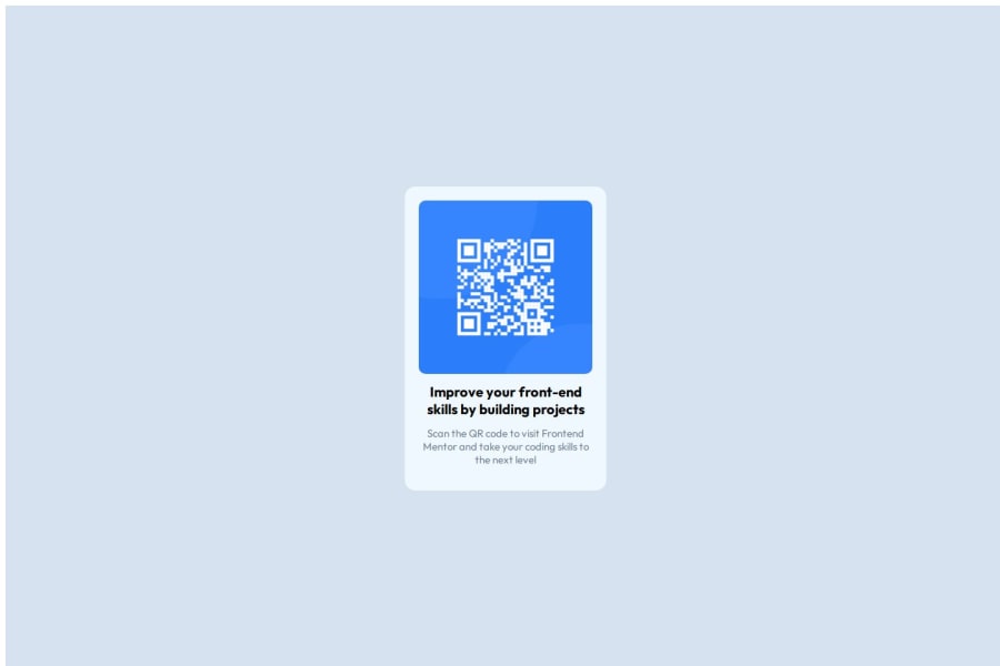


Design comparison

Community feedback
- @StroudyPosted about 2 months ago
Amazing job with this! You’re making fantastic progress. Here are some small tweaks that might take your solution to the next level…
-
Using a
<main>tag inside the<body>of your HTML is a best practice because it clearly identifies the main content of your page. This helps with accessibility and improves how search engines understand your content. Change from a<div>to<main><div class="main"> -
Having a clear and descriptive
alttext for images is important because it helps people who use screen readers understand the content, making your site more accessible. It also improves SEO, as search engines usealttext to understand the image's context, helping your site rank better, Check this out Write helpful Alt Text to describe images, -
Using a full modern CSS reset is beneficial because it removes default browser styling, creating a consistent starting point for your design across all browsers. It helps avoid unexpected layout issues and makes your styles more predictable, ensuring a uniform appearance on different devices and platforms, check out this site for a Full modern reset
-
While
pxis useful for precise, fixed sizing, such asborder-width,border-radius,inline-padding, and<img>sizes, it has limitations. Pixels don't scale well with user settings or adapt to different devices, which can negatively impact accessibility and responsiveness. For example, usingpxfor font sizes can make text harder to read on some screens, Check this article why font-size must NEVER be in pixels. In contrast, relative units likeremand adjust based on the user’s preferences and device settings, making your design more flexible and accessible. Usepxwhere exact sizing is needed, but prefer relative units for scalable layouts. If you want a deeper explanation watch this video by Kevin Powell CSS em and rem explained. Another great resource I found useful is this px to rem converter based on the default font-size of 16 pixel. -
Using
remoremunits in@mediaqueries is better thanpxbecause they are relative units that adapt to user settings, like their preferred font size. This makes your design more responsive and accessible, ensuring it looks good on different devices and respects user preferences.
You’re doing fantastic! I hope these tips help you as you continue your coding journey. Stay curious and keep experimenting—every challenge is an opportunity to learn. Have fun, and keep coding with confidence! 🌟
Marked as helpful1 -
- @MikDra1Posted about 2 months ago
Well done, here are some things to review 😊:
-
Overusing div tags: Try using more semantic HTML elements like
<section>,<header>, and<article>. It’ll help with both accessibility and SEO. -
Neglecting responsive design: Make sure you're using media queries and following a mobile-first approach so your site looks great on all devices.
-
Inconsistent class naming: It’s easy to end up with a mess of class names. Consider using a system like BEM for better organization and scalability.
-
Using px for everything: Instead of
pxfor fonts and layouts, try using relative units likeremoremto make your design more adaptable to different screen sizes. -
Forgetting alt text on images: Don’t skip the
altattribute. It’s essential for accessibility and helps search engines understand what your images are. -
Poor use of Flexbox and Grid: Be careful not to mix Flexbox and Grid unnecessarily. Each has its strengths—use the right one based on the layout needs.
-
Not testing across browsers: Don’t forget to check how your site looks in different browsers like Firefox and Safari. Cross-browser testing is super important.
-
Ignoring accessibility: Focus on features like keyboard navigation, contrast ratios, and ARIA labels. They make your site usable for more people.
-
Using fixed heights for elements: Setting fixed heights can cause overflow issues. Use
min-heightor allow content to expand naturally to avoid problems. -
Not using responsive images: Be sure to use
srcsetor the<picture>element to optimize images for different devices. This improves performance, especially on mobile.
Hope you found this comment helpful 💗💗💗
Good job and keep going 😁😊😉
Marked as helpful1 -


Please log in to post a comment
Log in with GitHub
Join our Discord community
Join thousands of Frontend Mentor community members taking the challenges, sharing resources, helping each other, and chatting about all things front-end!
Join our Discord