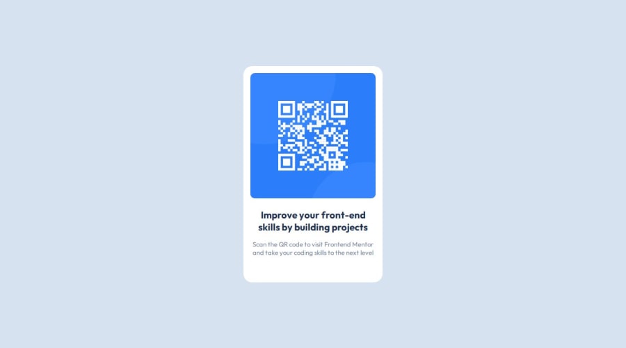
Design comparison
SolutionDesign
Solution retrospective
What are you most proud of, and what would you do differently next time?
I think that i did a good job, i probably have a problem with the size of my main container, but the rest is fine i think. It shrink well to a smaller size page format.
What challenges did you encounter, and how did you overcome them?I think the way to make it responsive, i don't know if i used the good method by using a media query, i wished i could do it without using any, but i don't think it was possible.
What specific areas of your project would you like help with?With my Responsive method, did i did well by using a media query, should i have use it at a higher width, or was there another way to do it ?
Community feedback
Please log in to post a comment
Log in with GitHubJoin our Discord community
Join thousands of Frontend Mentor community members taking the challenges, sharing resources, helping each other, and chatting about all things front-end!
Join our Discord
