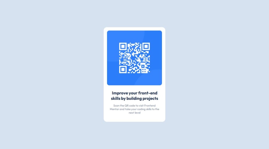
Design comparison
Solution retrospective
I'm proud of simply achieving it! Next time, I would handle centering things differently since I struggled a bit with that.
What challenges did you encounter, and how did you overcome them?What I'm really proud of is figuring out how to make that card design work, even though I had a bit of a mix-up with getting it centered. At first, I dove right into styling the card without setting up a container, so things weren't lining up like they should. But once I realized what was going on, I quickly fixed it by adding a proper container around the card. It was a good lesson in starting with a solid structure from the beginning. Next time, I'll definitely make sure to set up my containers right off the bat to avoid those early hiccups!
What specific areas of your project would you like help with?I attempted to use Figma but didn't quite grasp it, so I ended up writing the code directly. I needed help specifically with centering elements in my project.
Community feedback
Please log in to post a comment
Log in with GitHubJoin our Discord community
Join thousands of Frontend Mentor community members taking the challenges, sharing resources, helping each other, and chatting about all things front-end!
Join our Discord
