Design comparison
Community feedback
- @otimdanPosted 6 months ago
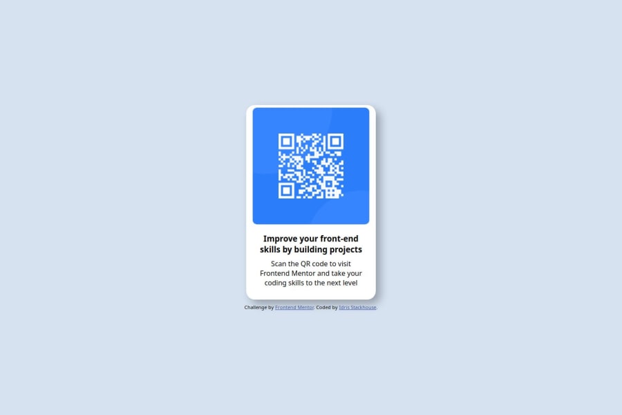
Your layout looks good, though the margin or padding on top of the qr code is not consistent with that on the sides. The text colours are different from those of the original Figma design.
0@sirstackhousePosted 6 months ago@otimdan Thanks Otim! for whatever reason my screenshot won't update. When you preview the site, the margin on the top is different.
0@otimdanPosted 6 months ago@sirstackhouse I've previewed the site and the margins and layout are spot on! Keep hacking :)
0
Please log in to post a comment
Log in with GitHubJoin our Discord community
Join thousands of Frontend Mentor community members taking the challenges, sharing resources, helping each other, and chatting about all things front-end!
Join our Discord
