Not Found
Not Found
Not Found
Not Found
Not Found
Not Found
Not Found
Not Found
Not Found
Not Found
Not Found
Not Found
Not Found
Not Found
Not Found
Not Found
Not Found
Not Found
Not Found
Not Found

Submitted

QR code html css

Reinaldiโ€ข 10

@reitamvan666

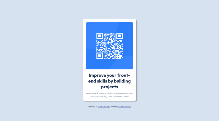
Desktop design screenshot for the QR code component coding challenge

This is a solution for...

  • HTML
  • CSS
1newbie
View challenge

Design comparison


SolutionDesign

Solution retrospective


im sorry for my english

im kinda confused in media query css, what is the difference between min and max? and how do i could use that on both ?

also why do i need to put margin auto when i put the display flex into the container not the body? so the good practical use is to put display flex on the body always? because when i display flex on the container, the container need a margin auto to make sure the content put into the middle , but the body doesnt need margin. Thanks

.container { background-color: var(--white); padding: 1.25rem; display: flex; flex-direction: column; align-items: center; justify-content: center; margin: auto; border-radius: 0.625rem; box-shadow: 5px 5px 5px rgba(0, 0, 0, 0.3); margin-bottom: 2rem; }

here is what i mean about container with margin auto if you guys confused about my english

Community feedback

Adrianoโ€ข 34,090

@AdrianoEscarabote

Posted

Hi Reinaldi, how are you?

I really liked the result of your project, but I have some tips that I think you will like:

1- Every page should have one main landmark <main>. So replace the div that wraps the whole content with <main> to improve the accessibility. click here

2- All page content should be contained by landmarks, you can understand better by clicking here: click here

We have to make sure that all content is contained in a reference region, designated with HTML5 reference elements or ARIA reference regions.

Example:

native HTML5 reference elements:

<body>
    <header>This is the header</header>
    <nav>This is the nav</nav>
    <main>This is the main</main>
    <footer>This is the footer</footer>
</body>

ARIA best practices call for using native HTML5 reference elements instead of ARIA functions whenever possible, but the markup in the following example works:

<body>
     <div role="banner">This is the header</div>
     <div role="navigation">This is the nav</div>
     <div role="main">This is the main</div>
     <div role="contentinfo">This is the footer</div>
</body>

It is a best practice to contain all content, except skip links, in distinct regions such as header, navigation, main, and footer.

Link to read more about: click here

2- Why it Matters

Navigating the web page is far simpler for screen reader users if all of the content splits between one or more high-level sections. Content outside of these sections is difficult to find, and its purpose may be unclear.

HTML has historically lacked some key semantic markers, such as the ability to designate sections of the page as the header, navigation, main content, and footer. Using both HTML5 elements and ARIA landmarks in the same element is considered a best practice, but the future will favor HTML regions as browser support increases.

Rule Description

It is a best practice to ensure that there is only one main landmark to navigate to the primary content of the page and that if the page contains iframe elements, each should either contain no landmarks, or just a single landmark.

Link to read more about: click here

Prefer to use rem over px to have your page working better across browsers and resizing the elements properly

The rest is great!!

Hope it helps...๐Ÿ‘

0
Lucas ๐Ÿ‘พโ€ข 104,420

@correlucas

Posted

๐Ÿ‘พHi @reitamvan666, congratulations on your first solution!๐Ÿ‘‹ Welcome to the Frontend Mentor Coding Community!

Great solution and a great start! From what I saw youโ€™re on the right track. Iโ€™ve few suggestions for you that you can consider adding to your code:

1.You can use <main> to replace the <div> containing the whole content, <div> is a block element without meaning and <main> is a tag the shows which is the most important block of content in this page.

2.Add the website favicon inserting the svg image inside the <head>. <link rel="icon" type="image/x-icon" href="./images/favicon-32x32.png">

3.The box-shadow is a bit too strong, this is due the opacity and blur. The secret to create a perfect and smooth shadow is to have low values for opacity and increase blur try this value instead: box-shadow: 12px 7px 20px 6px rgb(57 75 84 / 8%);

If youโ€™re not familiar to box-shadow you can use this site to create the shadow design and then just drop the code into the CSS: https://html-css-js.com/css/generator/box-shadow/

โœŒ๏ธ I hope this helps you and happy coding!

0

Please log in to post a comment

Log in with GitHub
Discord logo

Join our Discord community

Join thousands of Frontend Mentor community members taking the challenges, sharing resources, helping each other, and chatting about all things front-end!

Join our Discord