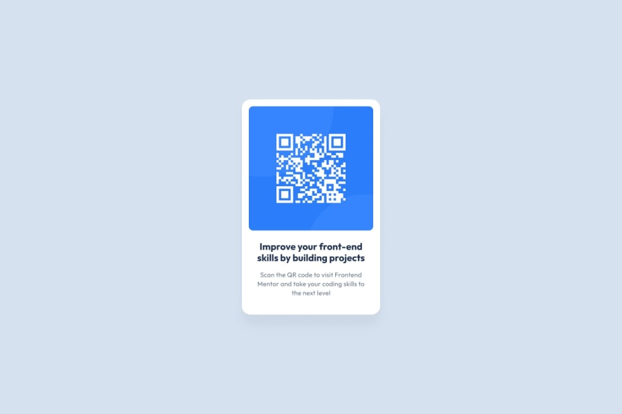
Design comparison
Community feedback
- @hannahro15Posted over 2 years ago
Hello and congratulations on completing this challenge!
Just a small point. In the starter files there is a style guide which mentions which fonts are used as part of the design which you see when you open up visual studio code or similar. The background colour needs to be a lighter shade of grey and these details should be found in the style guide. I would also suggest a little less padding between the QR code component and the edge of the container, and also where the written content is underneath the QR code.
Well done for centering the whole card. I have been having problems with making everything central!
Hope this helps!
0
Please log in to post a comment
Log in with GitHubJoin our Discord community
Join thousands of Frontend Mentor community members taking the challenges, sharing resources, helping each other, and chatting about all things front-end!
Join our Discord
