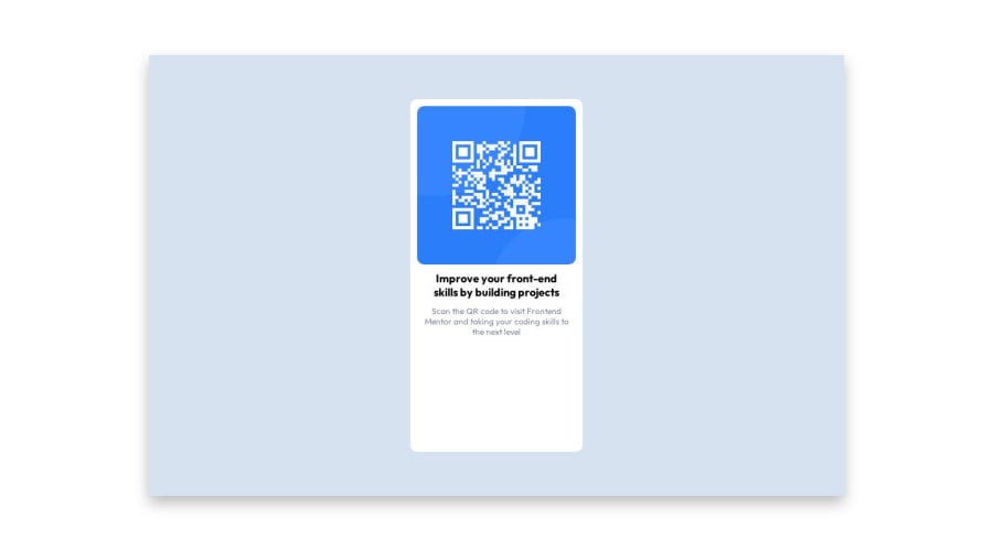
Design comparison
SolutionDesign
Solution retrospective
Have you know one way to make my code better?
Did you see errors in my project?
Community feedback
- @dotmankiPosted about 1 year ago
hi, your solution is good. Here is my feedback:
- i see in your code that you are using two media queries, one for desktop and the other for mobile. Personally i follow a mobile first approach and only include desktop media queries
- i would use CSS variables for color palette to make a more reusable code.
- the card container is taller than content in desktop viewport, i'd change that height setting to 'auto'
Marked as helpful0 - @irenanrodriguesPosted about 1 year ago
Fala Gabriel blz? Recomendo tirar o
height: 80%;de.blue-box .qrcode-box. Quando está na versão Desktop, fica um espaço grande em baixo do texto. Mas parabéns pela solução.Marked as helpful0
Please log in to post a comment
Log in with GitHubJoin our Discord community
Join thousands of Frontend Mentor community members taking the challenges, sharing resources, helping each other, and chatting about all things front-end!
Join our Discord
