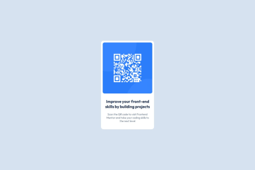
Submitted about 1 year agoA solution to the QR code component challenge
QR Code Example Solved
@AhmedMahmoud6

Solution retrospective
What are you most proud of, and what would you do differently next time?
Iam Proud that this task made me learn new things and i learned them quickly
What challenges did you encounter, and how did you overcome them?i've had some challenges with hosting the project and also there was a problem with the photo not loading and i've solved the photo problem by specifying the right path and solved the host by reading the documentation.
What specific areas of your project would you like help with?Is it okay to use the code below to make spaces between the elements every time or there's a better approach to do the same
    display: flex;
    flex-direction: column;
    gap: 20px;
Thanks in advance.
Code
Loading...
Please log in to post a comment
Log in with GitHubCommunity feedback
No feedback yet. Be the first to give feedback on Ahmed Zaki's solution.
Join our Discord community
Join thousands of Frontend Mentor community members taking the challenges, sharing resources, helping each other, and chatting about all things front-end!
Join our Discord