Design comparison
SolutionDesign
Community feedback
- @Youssef5107Posted 9 months ago
Hello, Durgesh3829
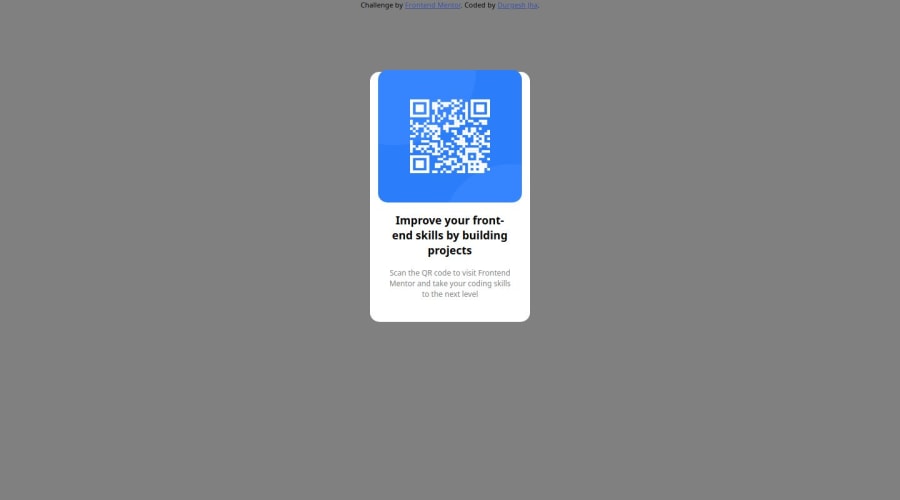
Congratulations on completing "QR code" challenge . I have some advices to help you improving it , add a new div that contains the "box" div then add: display:flex; (to use flex properties) height: 100vh; (to make sure that the new div take the whole page height) align-items: centre (to center vertically ) Justify-content:center; (to center horizontally) margin-top is not the best way to centre your div as it fix its position so you can delete the style(margin-top: 100px ) from your "box" div and use better the flex properties
0
Please log in to post a comment
Log in with GitHubJoin our Discord community
Join thousands of Frontend Mentor community members taking the challenges, sharing resources, helping each other, and chatting about all things front-end!
Join our Discord
