Not Found
Not Found
Not Found
Not Found
Not Found
Not Found
Not Found
Not Found
Not Found
Not Found
Not Found
Not Found
Not Found
Not Found
Not Found
Not Found
Not Found
Not Found
Not Found
Not Found

Submitted

QR Code displayer by CSS

@akshtt

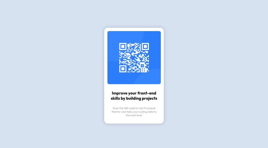
Desktop design screenshot for the QR code component coding challenge

This is a solution for...

  • HTML
  • CSS
1newbie
View challenge

Design comparison


SolutionDesign

Solution retrospective


How to accurately judge the measurements from a preview image only? I was confused that in the preview image box shadow is present or not. So how to judge more accurately the minor details of design which are not mentioned in the style sheet?

Community feedback

Juanca 220

@juancaorg

Posted

Hi Akshat 👋,

Answering your questions,

Judging the measurements from a preview image only accurately is pretty hard.

Ideally, you'll have the original design on Figma/Sketch/Adobe XD to work on, but if that isn't the case, you can leverage various tools for measuring.

The one that I'm currently using and I would recommend (and found in the Frontendmentor Resources) is PixelSnap. It's pretty handy once you get used to it and has great tolerance config when the tool struggles to measure because of low contrast.

Unfortunately, is a macOS exclusive and paid app. If you don't have the resources, the next best thing that I found is the web extension Dimensions. Available in Chrome and Firefox and is totally free. Of course, for this case, you would have to open the preview image in your browser to measure.

Keep in mind the zoom level when measuring with these tools. These tools don't keep in mind the "real" dimension, they just measure whatever is on screen, so it can get tricky. Try to get the whole image on screen to get closer to the real dimensions when measuring.

And again, this isn't a substitute for using the original design, but these are useful tools nonetheless.

For minor details, like distinguishing if you should add a box-shadow or not, I use a color checker/picker to check for any contrast and to be sure if I should add one.

The one that I'm currently using is Sip, again, macOS exclusive and paid app. But there's probably a web extension available in Chrome and Firefox, but I ignore which is the best, so I can't recommend any for now.

And the last, for checking details in general, is just training your eye. The more you practice and the more more UIs you watch in general, the more details you'll spot.

~~Anyway, that's a lot of text. Sorry.~~ Hope this helps you out 🙌

Marked as helpful

0
Adriano 34,090

@AdrianoEscarabote

Posted

Hello Akshat Tiwari, how are you?

welcome to the front-end mentor community.

I really liked the result of your project, but I have some tips that I think you will like:

1- All page content should be contained by landmarks click here

2- Document should have one main landmark, you could have put all the content inside the main tag click here

3- <html> element must have a lang attribute click here

4- Page should contain a level-one heading, you could have replaced p.head with h1 click here

I noticed that you tried to center the content using margin, always prefer to use flex-box or grid to center use margin only in the last case:

withdrew:

.main { /* margin: 150px auto 150px; */ }

I added:

body {
    display: flex;
    align-items: center;
    justify-content: center;
    min height: 100vh;
}

The rest is great!!

Hope it helps...👍

Marked as helpful

0

Please log in to post a comment

Log in with GitHub
Discord logo

Join our Discord community

Join thousands of Frontend Mentor community members taking the challenges, sharing resources, helping each other, and chatting about all things front-end!

Join our Discord