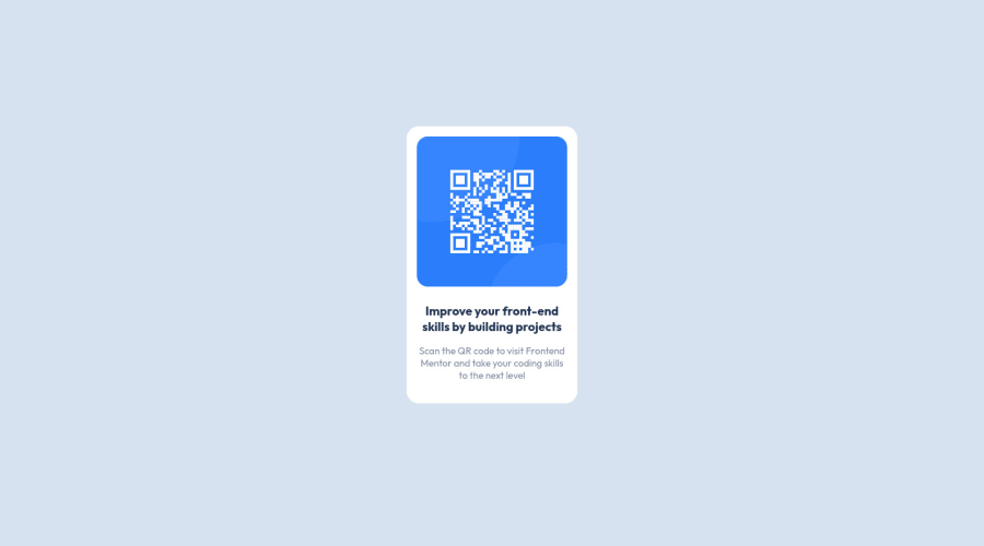
Design comparison
Solution retrospective
Hi guys, could someone review my code and tell me if it's okay (what could I do better etc.)? I am starting my journey with webdev and want to improve my skills
Community feedback
- @elaineleungPosted about 2 years ago
Hi Maylay, welcome to Frontend Mentor, and great job completing this first challenge! I think you did many things well here, such as giving meaningful names to your classes and also in centering the component. If there's one thing to suggest, I would just add a bit of margin around the
container
so that at smaller screen sizes when the component starts resizing, there would be some spacing around the sides. One other small thing I'd suggest is that, instead of calling the card acontainer
, I probably would name itcard
orcomponent
, since calling it acontainer
usually suggests that it contains more than one thing, but I consider the card to just be one item only (even though it's made up of an image and text). In bigger projects especially, such as landing pages, you'd normally want to use acontainer
in each section or landmark, since it can help with limiting the width and also to keep all the contents of the section contained in one div.Great job over all, and hope to see more solutions!
Marked as helpful2 - @correlucasPosted about 2 years ago
👾Hello Maylay, congratulations for your first solution!👋 Welcome to the Frontend Mentor Coding Community!
Great solution and great start! By what I saw you’re on the right track. I’ve few suggestions to you that you can consider to add to your code:
Something I've noticed in your code is that in many occasions you've added some
<div>
to wrap contents that don't really need to be inside of a div block. Note that for this challenge all you need is a single block to hold all the content, can be<div>
or<main>
if you want to use a semantic tag to wrap the content, the cleanest structure for this challenge is made by a block of content with div/main and all the content inside of it (img, h1 and p) without need of any other div or something. See the structure below:<body> <main> <img src="./images/image-qr-code.png" alt="Qr Code Image" > <h1>Improve your front-end skills by building projects</h1> <p>Scan the QR code to visit Frontend Mentor and take your coding skills to the next level</p> </main> </body>
✌️ I hope this helps you and happy coding!
Marked as helpful2
Please log in to post a comment
Log in with GitHubJoin our Discord community
Join thousands of Frontend Mentor community members taking the challenges, sharing resources, helping each other, and chatting about all things front-end!
Join our Discord