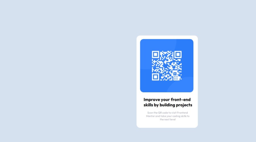
QR Code Design With HTML and CSS
Design comparison
Solution retrospective
I could do it myself without help
What challenges did you encounter, and how did you overcome them?No challanges
What specific areas of your project would you like help with?Nothing in particular
Community feedback
- @justinconnellPosted about 1 year ago
Hi @DammyFaffy, Congratulations on submitting your solution!
I noticed that it is not centred on the page so took a look at the code and noticed that you used margins. I assume that using those settings it looked good on your screen, but unfortunately there are may screen sizes that need to be considered when implementing a design - to get elements centred on the screen there are two good options to use:
- FlexBox documented here
- or CSS Grid documented here
The trick is to have a container that takes up
100vh(100% of the viewport height) and100vw(100% viewport width) and then to centre the child element in the container element.In your code this can be done with the following changes:
body {
    height: 100vh;
    background-color: rgb(213, 225, 239, 255);
    /* width: 1440px; */
    display: grid;
    place-content: center;
}

.container {
    /* margin-top: 200px; */
    /* margin-left: 760px; */
    /* margin-right: 700px; */
    background-color: white;
    height: 500px;
    width: 325px;
    padding-left: 20px;
    padding-top: 20px;
    border-radius: 20px;
    /* overflow: hidden; */
}
Note, I commented out the unnecessary code above. I do have a question though - why did you set 'overflow: hidden'?
I hope you find this feedback helpful
Keep on coding! J
Marked as helpful0@FafioluOluwadamilolaPosted about 1 year ago@justinconnell Thanks Justin, I really like the way you pointed out my mistakes. I'll be sure to check out the FlexBox and CSS Grid.
I just started learning so I didn't know the code to curve the corners of images, so I got this when I checked Chatgpt:
border-radius: 20px; overflow: hidden; overflow: hidden; ensures that the image stays within the rounded boundaries, hiding any parts that extend beyond the curve.
0@justinconnellPosted about 1 year ago@DammyFaffy
Thanks for getting back on this. It's great that you're learning and using tools to help you get answers - just be aware that ChatGPT can get things horribly wrong, so rather look at resources such as MDN, CSS Tricks and Stack Overflow - out of interest how much of the CSS came from ChatGPT?
Marked as helpful0@FafioluOluwadamilolaPosted about 1 year ago@justinconnell Its just the border radius that I used from Chatgpt, nothing else
1@FafioluOluwadamilolaPosted about 1 year ago@justinconnell Pls check my solution here, I have problems making it responsive for mobile can you pls help me
You can see my solution here: https://www.frontendmentor.io/solutions/responsive-recipe-page-using-html-and-css-Nk9wzlOpWc
Any suggestions on how I can improve are welcome!
0@justinconnellPosted about 1 year agoHi @DammyFaffy, I will take a look at that today!
0
Please log in to post a comment
Log in with GitHubJoin our Discord community
Join thousands of Frontend Mentor community members taking the challenges, sharing resources, helping each other, and chatting about all things front-end!
Join our Discord
