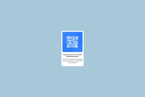
Design comparison
Solution retrospective
I am proud of my flex-box path and also my beginners design and next time i would use more js.
What challenges did you encounter, and how did you overcome them?The challenge i encountered during my design was how to center my div and I watched some of bro code CSS video
Community feedback
- @gmagnenatPosted 3 months ago
Hi, congrats on finishing this challenge!
I’ve looked over your solution and have some tips to help you improve. Here’s what you can work on:
does the solution include semantic html?
- Main landmark: Add a
<main>
element to wrap the main content of your page. This makes it easier for screen readers and improves the page structure. - Missing closing tag: It looks like there’s a missing
</div>
tag. Make sure all your tags are properly closed to avoid layout issues. - Alt attribute: The image needs an
alt
attribute. This helps users who can’t see the image understand what it’s about.
is it accessible, and what improvements could be made?
- CSS reset: Use a modern CSS reset at the top of your stylesheet. This helps make sure your site looks the same in different browsers. You can find good resets from Josh Comeau or Andy Bell.
- Min-height on body: Set a
min-height
on the body so the layout adapts if the font size is changed. This helps prevent content from getting cut off. - Card width: Instead of using a fixed width for your card, use
max-width
. This helps the card resize better on different screen sizes. - Image sizing:
- Don’t use fixed pixel values for the width and height of the image. Set the image’s width to
100%
so it can scale with its container. - Remove any fixed width, max-width, height, and max-height from the image. The image should adjust with the content.
- If you have a class named
.img
, make sure it’s used for the actual image. It can be confusing if the class name doesn’t match the element.
- Don’t use fixed pixel values for the width and height of the image. Set the image’s width to
does the layout look good on a range of screen sizes?
- It looks a bit small compared to the design
is the code well-structured, readable, and reusable?
- CSS classes: Avoid styling HTML elements directly. Use classes instead. This makes your CSS easier to manage and change later.
- Class naming: If you have a class named
.img
, make sure it actually applies to an image. It’s best to use clear and meaningful class names.
I hope these tips help you improve your code. If you have any questions or need more details, just let me know.
Happy coding!
0@samuelbm12Posted 3 months agoThan you so much for the tips and they are all noted down thanks. I also have a question about the names you mentioned Josh Comeau and Andy Bell are they youtubers?@gmagnenat
0 - Main landmark: Add a
Please log in to post a comment
Log in with GitHubJoin our Discord community
Join thousands of Frontend Mentor community members taking the challenges, sharing resources, helping each other, and chatting about all things front-end!
Join our Discord