

Design comparison

Solution retrospective
I am proud of that It took 10 minutes to do that.I could make it with no second thoughts.Style guide was clear and this project help me to understand how things work for challenges:)
What challenges did you encounter, and how did you overcome them?I learned to follow style guide.
Community feedback
- @josealzate97Posted 27 days ago
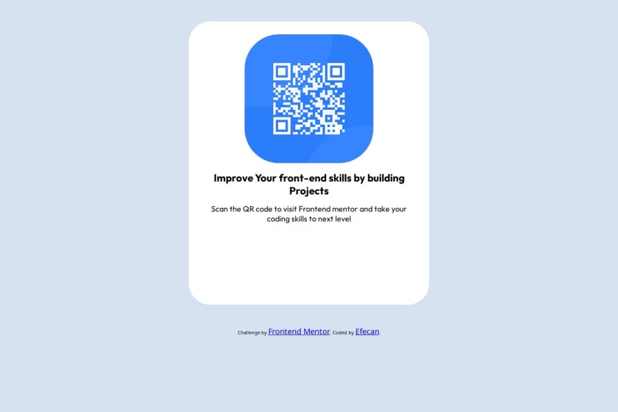
Hello Efecan, your solution looks good but it can be improved by placing a border-radius of 10px on the main white div and the QR image. You could also leave a width of 350px on the main white div... that way the specifications of the example would fit better.
use a H1 in the bolder text and a 15px p label on the secondary text.
Marked as helpful1 - @MaruchetOPosted about 1 month ago
Good work! I think that the design can be improved. There is a figma file of the design you can use for the improvement.
Marked as helpful1


Please log in to post a comment
Log in with GitHubJoin our Discord community
Join thousands of Frontend Mentor community members taking the challenges, sharing resources, helping each other, and chatting about all things front-end!
Join our Discord