Design comparison
Community feedback
- @correlucasPosted over 2 years ago
Hello Enochlee , congratulations for your challenge solution!
I saw your live site and you did a good work, there's only two minor details your consider fixing to improve the solution!
-
Since the main things in this solution is the card component, use <main> instead of section.
-
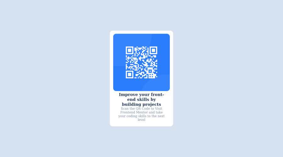
You card doesn't have a proper padding around the elements, you should use a value around 16px, a quick solution is use the padding value inside the section/main and give a single padding for all the elements, keeping the card with a uniform space around elements.
section { padding: 16px;}I hope it helps you bro, happy coding!
Marked as helpful1@iamenochleePosted over 2 years ago@correlucas thanks for your observations, I also missed the shadow, lol
1 -
Please log in to post a comment
Log in with GitHubJoin our Discord community
Join thousands of Frontend Mentor community members taking the challenges, sharing resources, helping each other, and chatting about all things front-end!
Join our Discord
