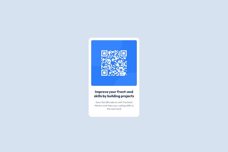
Design comparison
Solution retrospective
I am most proud of the fact that I managed to complete this challenge quite easily after a long time of not doing anything related to programming.
What challenges did you encounter, and how did you overcome them?I encountered a challenge with the spacing and alignment on the text part of the QR Code Card. I managed to overcome it by looking again on the Figma File and reading the design details of that part.
What specific areas of your project would you like help with?There is nothing specific as I think I nailed it, but I still want some feedback on my code. What could I improve and do better.
Community feedback
- P@Islandstone89Posted 4 months ago
Hi Timi, well done!
Here is some feedback :)
HTML:
-
Every webpage needs a
<main>that wraps all of the content, except for<header>andfooter>. This is vital for accessibility, as it helps screen readers identify a page's "main" content. Change.main-containerto a<main>. -
I would change the heading to a
<h2>- a page should only have one<h1>, reserved for the main heading. As this is a card heading, it would likely not be the main heading on a page with several components.
CSS:
-
Including a CSS Reset at the top is good practice.
-
It's common to set
font-familyon thebody, and let its children inherit the value. Also, remember to specify a fallback font:font-family: 'Outfit',sans-serif; -
I recommend adding a bit of
padding, for example16px, on thebody, to ensure the card doesn't touch the edges on small screens. -
I would move the styles on
.main-containerto thebody. -
On the
body, changeheighttomin-height: 100svh- this way, the content will not get cut off if it grows beneath the viewport. -
Remove all widths and heights in
px. We rarely want to give a component a fixed size, as we need it to grow and shrink according to the screen size. -
We do want to limit the width of the card, so it doesn't get too wide on larger screens. To solve this issue, give the card a
max-widthof around20rem. -
letter-spacingshould not be inpx. You can useem, where1emequals the element's font size. -
Paragraphs have a default value of
font-weight: 400, so there is no need to declare it. -
On the image, add
display: block,height: autoandmax-width: 100%- the max-width prevents it from overflowing its container. Without this, an image would overflow if its intrinsic size is wider than the container.max-width: 100%makes the image shrink to fit inside its container.
Marked as helpful1@timilica29Posted 4 months ago@Islandstone89 Thank you so much for the feedback! Will definitely come back and update with these suggestions!
1 -
Please log in to post a comment
Log in with GitHubJoin our Discord community
Join thousands of Frontend Mentor community members taking the challenges, sharing resources, helping each other, and chatting about all things front-end!
Join our Discord
