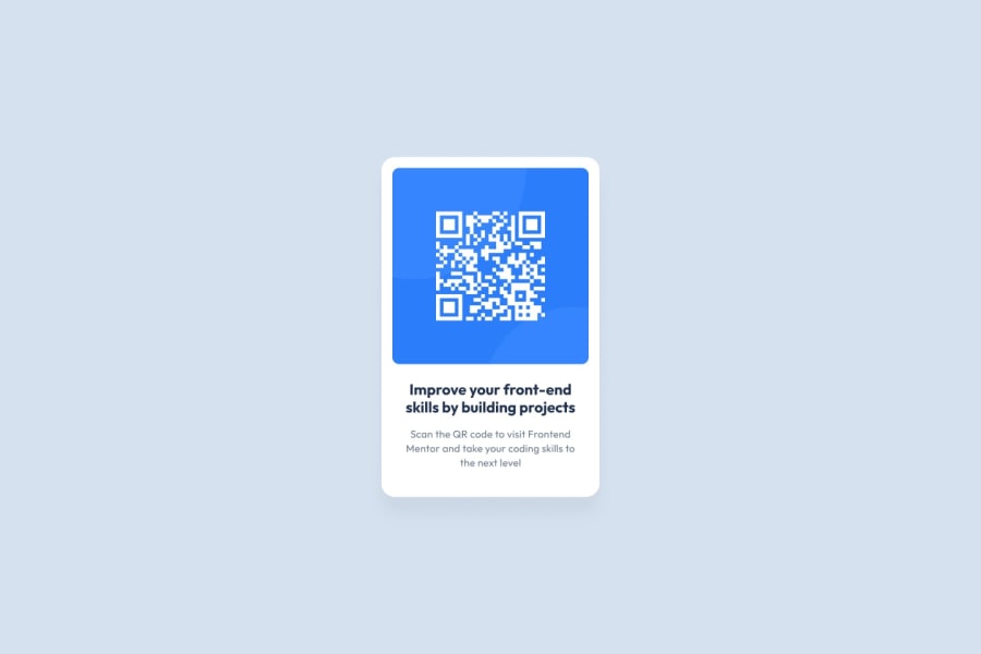
Design comparison
Community feedback
- @k1tesurfenPosted about 1 year ago
**First impression
You can clearly see the design of the given jpg in your solution. The site works good for all screen sizes. Text placement and font weights are spot on!
**What could be better?
-Some sizes are a little off. Size of the card itself is too small and the padding of it as well. You could use some image editing software (Photoshop, Affinity Designer, Gimp) to measure all pixel values to make it closer to the desired design. -The footnote is not visible, only if you scroll down. You could just make it 'position: absolute' and stick it to the bottom with 'bottom: 10px; left: 10px'
But congrats on the challenge. Keep it up
Marked as helpful1
Please log in to post a comment
Log in with GitHubJoin our Discord community
Join thousands of Frontend Mentor community members taking the challenges, sharing resources, helping each other, and chatting about all things front-end!
Join our Discord
