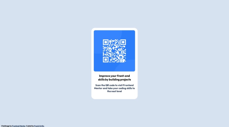
Design comparison
SolutionDesign
Community feedback
- @grace-snowPosted about 1 year ago
Hi, I hope this feedback is helpful. I'll write as a list and hopefully you can work through each item as I'm off the rest of this week. Others are available for more help on Discord if you need it - just start a new post in the #Help channel :)
footeris a distinct landmark frommain. It should sit after it- The body will need to be made into a flex column if this is the approach you're using to center the component on the screen
- Give main some padding so the component can't touch screen edges (Alternatively, you could give the card some margin on all sides, or give the body a little padding)
- The card must have a max-width in rem
- The alt text on the image needs to be a proper description. Remember, alt is not code, it is important content! For example "QR code to FrontendMentor.io" would be a good description for this image
- You are loading either the incorrect fonts or the incorrect widths. Check these in the styleguide and amend what you are downloading and applying
- Try to get the font sizes and appearance much closer to the design. That includes family, weight, size, line height and vertical margins
- ALWAYS include a modern CSS reset at the very start of the styles. That will do lots of important things, but one of them is set images to display block max-width 100%
p.s. Don't forget to update the attribution link so it goes somewhere meaningful! The link for your name could go to your frontend mentor profile page, for example
Marked as helpful0
Please log in to post a comment
Log in with GitHubJoin our Discord community
Join thousands of Frontend Mentor community members taking the challenges, sharing resources, helping each other, and chatting about all things front-end!
Join our Discord
