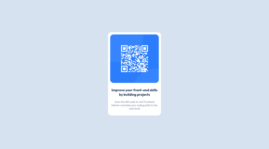
Design comparison
Solution retrospective
The easy project u can work on, even if u still a beginner u can work on it easily, it took 1hr completing this project
Community feedback
- @AgataLiberskaPosted almost 3 years ago
Hi Mohamed, nice work :) Awesome that you remembered to include you landmark elements :)
However, it would be a good idea for you to really consider why you're applying certain styles. For example, you've set your body to
display: flex;
but you're not actually taking advantage of this - in fact, it actually messes things up a bit - when I open your solution, the card is stuck to the left of the screen - because of that display: flex property. You've also set a blue background on all elements, which you then had to override on your content container - it would've been a lot simpler to set the blue background on the body and white background on the card. Setting the height property on your card is also quite unnecessary - and again, it does mess things up on some larger mobile viewports where the white card is tiny and all content is overflowing it. Let the content take up the space that it needs, and space it out with some padding.Hope this helps, happy coding :)
Marked as helpful0@khalilbndPosted almost 3 years ago@AgataLiberska Thank u so much, for the "flex" content i did remember that i fix it cause obviousely i knew that i can't let it on the left of course, and also now i know that i did override all content of the page with root selector, i appreciate your help
0
Please log in to post a comment
Log in with GitHubJoin our Discord community
Join thousands of Frontend Mentor community members taking the challenges, sharing resources, helping each other, and chatting about all things front-end!
Join our Discord