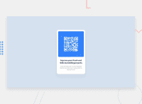
Design comparison
Solution retrospective
Probably using flexbox or grid next time to center the container element; or just other options out there, just to learn what else is out there and how they work.
What challenges did you encounter, and how did you overcome them?Probably the CSS classes naming, lol!
What specific areas of your project would you like help with?- What are the best options for centering a div or any other element for that matter?
- What are the best ways/best-practices for naming CSS classes?
- How good was my selection of elements to build this project? I mean, should I have wrapped the different elements in divs or sections or was this approach good enough?
Community feedback
- @ElianPujolsPosted 3 months ago
Hola Pedro, espero que esto te pueda servir. ¿Cuáles son las mejores opciones para centrar un div o cualquier otro elemento? Una de las mejores maneras de centrar un div u otra etiqueta es Flexbox, ya que con esta podemos hacer que se adapte y se visualice de mejor manera. ¿Cuáles son las mejores formas/mejores prácticas para nombrar clases CSS? Una de las mejores prácticas para nombrar clases en CSS es la metodología BEM (Bloque, Elemento, Modificador), ya que esta te ayuda a dar una mejor estructura y mantenimiento del código.
Marked as helpful1@skipperr254Posted 3 months ago@ElianPujols Hola Elián. Muchas gracias por los comentarios y los consejos. Para el centrado, acabo de aprender a utilizar el posicionamiento absoluto y las traducciones, por lo que los implementé en esta solución. He usado flexbox por un tiempo y quería probar algo nuevo. Seguiré usando flexbox y veré cómo va. Gracias por la introducción a BEM. Definitivamente lo veremos con efecto inmediato.
0 - @shwertsPosted 3 months ago
Your QR code card is almost perfect if looking in HTML & CSS codes. Good choice of semantic elements.
Here is what you should\can do:
- Change the
<body>element's background color; - Delete
<footer>content and styles, that applies to it. - Delete current
README.mdfile and renameREADME-template.mdtoREADME.md.
You can use the CSS Flexbox to center a container inside parent element:
body {
  display: flex;
  align-items: center;
  justify-content: center;
  min-height: 100vh; /* To give the body space for centering element horizontally */
}
You can also combine it with
margin: auto;which makesjustify-contentproperty unnecessary.Marked as helpful1@skipperr254Posted 3 months ago@shwerts Hi there shwerts. Thanks for the feedback.
I thought of being adventurous in this project and hence I went with the absolute positioning and the translation. Will definitely be using flexbox for future projects.
About the README file, I just noticed I forgot to work on it. Will be updating it. Thanks.
0 - Change the
- @Islandstone89Posted 3 months ago
Hello, Peter! Well done finishing this challenge - while it looks simple, there are quite a few things to be aware of.
Here are my suggestions - I hope you find them helpful :)
HTML:
-
Inside of
<main>, I would create a<div class="card">and move the card content from the<main>to that<div>- a<main>would most likely contain several components, not just a card. -
I would change the heading to a
<h2>- a page should only have one<h1>, reserved for the main heading. As this is a card heading, it would likely not be the main heading on a page with several components. -
Footer text needs to be wrapped in one or two
<p>elements.
CSS:
-
Including a CSS Reset at the top is good practice.
-
I like to add
1remofpaddingon thebody, to ensure the card doesn't touch the edges on small screens. -
Change the
background-colorfrom#d5e1e5to#d5e1ee. -
font-familyshould be placed onbodyinstead of*. -
Remove
heightonbody. -
Remove the margin on the card.
-
Remove all
positionandtransformproperties. -
An effective way to center something, is to use Flexbox on the parent of the element you want centered. To center both the main and the footer, with some space between them, set the following on
body:
display: flex; flex-direction: column; justify-content: center; align-items: center; min-height: 100svh; gap: 2rem;-
max-widthon the card should be in rem - change it to20rem, which equals320px. -
font-sizemust never be in px. This is a big accessibility issue, as it prevents the font size from scaling with the user's default setting in the browser. Use rem instead. -
letter-spacingmust also never be inpx. You can useem, where1emequals the font size of the element. -
Since all of the text should be centered, you only need to set
text-align: centeron the body, and remove it elsewhere. The children will inherit the value. -
Well done for having
max-width: 100%on the image! It is also common to set all images todisplay: block- this prevents unwanted space underneath images.
0 -
Please log in to post a comment
Log in with GitHubJoin our Discord community
Join thousands of Frontend Mentor community members taking the challenges, sharing resources, helping each other, and chatting about all things front-end!
Join our Discord

