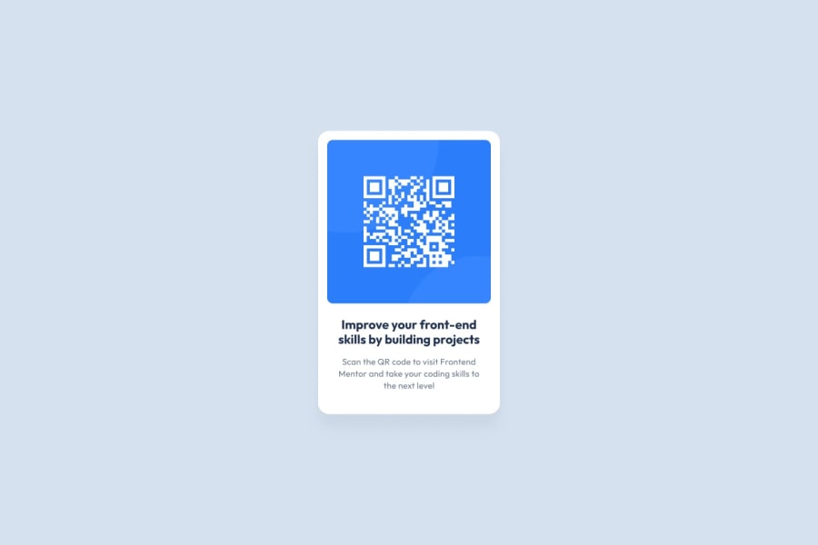
Design comparison
Solution retrospective
I am most proud of designing a clean and functional QR code card that effectively encourages users to enhance their front-end development skills by engaging with practical projects. The minimalistic design with a clear call-to-action successfully communicates the purpose, making it easy for users to understand and act upon the message.
If I were to redo this project, I would explore integrating animations or interactive elements to make the design more engaging. Adding subtle animations when users hover over the card could capture attention more effectively and enhance the user experience.
What challenges did you encounter, and how did you overcome them?One challenge was ensuring the QR code's readability while maintaining a cohesive design aesthetic. It was crucial to balance the visual elements to avoid clutter while ensuring the QR code was prominently displayed and functional.
To overcome this, I focused on creating ample contrast between the QR code and the background, using a simple color scheme to ensure that the QR code scanner could easily detect and read the code. Testing with different devices and applications helped refine the design to maximize functionality across platforms.
What specific areas of your project would you like help with?-
Design Enhancement: I would appreciate feedback on how to make the design more visually appealing while keeping it functional and straightforward.
-
User Engagement: Suggestions on how to increase user interaction with the card, such as incorporating dynamic elements, would be valuable.
-
Code Optimization: Advice on optimizing the HTML/CSS code used to create this design, focusing on best practices and performance improvements, would be helpful.
Please log in to post a comment
Log in with GitHubCommunity feedback
No feedback yet. Be the first to give feedback on Fahith K.R.M.'s solution.
Join our Discord community
Join thousands of Frontend Mentor community members taking the challenges, sharing resources, helping each other, and chatting about all things front-end!
Join our Discord
