Not Found
Not Found
Not Found
Not Found
Not Found
Not Found
Not Found
Not Found
Not Found
Not Found
Not Found
Not Found
Not Found
Not Found
Not Found
Not Found
Not Found
Not Found
Not Found
Not Found

Submitted

QR code components

@Codevkreate

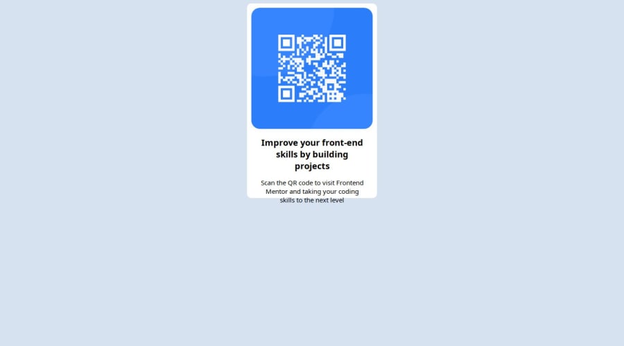
Desktop design screenshot for the QR code component coding challenge

This is a solution for...

  • HTML
  • CSS
1newbie
View challenge

Design comparison


SolutionDesign

Solution retrospective


What are you most proud of, and what would you do differently next time?

I don't know yet I'm just starting out

What challenges did you encounter, and how did you overcome them?

I don't quite remember, it's been a while since I completed the challenge before submitting it

What specific areas of your project would you like help with?

None for now

Community feedback

@MukarramHaq

Posted

Hey! good work on the project.

Here are a few recommendations that I feel like would help:

HTML:

  1. Every webpage should have <main> to wrap its main content around. Other tags include <header> <footer> but these are irrelevant for this current project. These are extremely important for accessibility. So wrap your card with <main> tag.
  2. For this current project, you would need only one class for the card. That should be sufficient for this project.

CSS:

  1. Include 1rem of padding on the body. That prevents the card from touching the edges on a small screen.
  2. To try and center the div you can use Flexbox property. Here is a link that will help you with this.
  3. One of the people from the community pointed out that I shouldn't use widths and heights because in web design, we need our components to adjust to the size of different screens. Setting it to px will fix them to those properties and they will not be able to adjust.
  4. font-size should never be in px. This prevents the font from scaling. A better approach would be to use rem instead.
  5. Put the font-family in the body. Remember to also specify a fallback font font-family: 'Outfit', 'san-serif';
  6. You can use display: block; and max-width: 100% to prevent the content from overflowing.
  7. Also, it would be a good idea to create a separate CSS file for all the styling. Makes it easier to debug and maintain.

These are all the tips I received when I submitted this challenge and I made almost the same mistakes. So I thought it would be helpful for you as well. :)

Marked as helpful

2

@Codevkreate

Posted

Thanks a lot brother 😊 @MukarramHaq

1

@MukarramHaq

Posted

@Codevkreate Glad I could help! :)

0

Please log in to post a comment

Log in with GitHub
Discord logo

Join our Discord community

Join thousands of Frontend Mentor community members taking the challenges, sharing resources, helping each other, and chatting about all things front-end!

Join our Discord