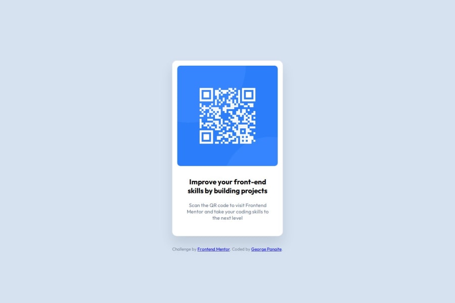
QR-Code-Component(HTML, CSS, Flexbox, Mediaqueries, Variables; VSCode)
Design comparison
Community feedback
- P@StroudyPosted 6 months ago
Exceptional work! You’re showing great skill here. I’ve got a couple of minor suggestions that could make this stand out even more…
-
Using a
<main>tag inside the<body>of your HTML is a best practice because it clearly identifies the main content of your page. This helps with accessibility and improves how search engines understand your content. -
For future project, You could download and host your own fonts using
@font-faceimproves website performance by reducing external requests, provides more control over font usage, ensures consistency across browsers, enhances offline availability, and avoids potential issues if third-party font services become unavailable. Place to get .woff2 fonts -
Using a full modern CSS reset is beneficial because it removes default browser styling, creating a consistent starting point for your design across all browsers. It helps avoid unexpected layout issues and makes your styles more predictable, ensuring a uniform appearance on different devices and platforms, check out this site for a Full modern reset
-
Using
remoremunits in@mediaqueries is better thanpxbecause they are relative units that adapt to user settings, like their preferred font size. This makes your design more responsive and accessible, ensuring it looks good on different devices and respects user preferences. -
I think you can benefit from using a naming convention like BEM (Block, Element, Modifier) is beneficial because it makes your CSS more organized, readable, and easier to maintain. BEM helps you clearly understand the purpose of each class, avoid naming conflicts, and create reusable components, leading to a more scalable codebase. For more details BEM,
I hope you’re finding this guidance useful! Keep refining your skills and tackling new challenges with confidence. You’re making great progress—stay motivated and keep coding with enthusiasm! 💻
Marked as helpful1P@lynx232Posted 6 months agoThank you for the advice! I will keep in mind to use a <main> tag in the future. Even though i found it easier to import the font i will try to host it in the future.(thank you for the resources). I did not know that there was more to the reset function. About the measurements in media queries, that was a mistake on my part :)) I will keep in mind to implement BEM in the future. @Stroudy
1P@StroudyPosted 6 months agoHey @lynx232, Bro you smashed this challenge, When you generate a accessibility report you will get a error landmark, This is because of the main tag is missing, Importing fonts in defiantly easier but in the real world you will host them, Once you know how to do it, Doesn't take much time to implement it. 💪
0 -
- @ccadubrPosted 6 months ago
Great job on the code organization—it's clean and easy to follow. The use of semantic HTML is solid, though you might want to ensure headings follow a proper hierarchy.
1P@lynx232Posted 6 months agoThank you for the advice! Do you have any suggestions regarding the hierarchy?@ccadubr
0
Please log in to post a comment
Log in with GitHubJoin our Discord community
Join thousands of Frontend Mentor community members taking the challenges, sharing resources, helping each other, and chatting about all things front-end!
Join our Discord
