

Design comparison

Solution retrospective
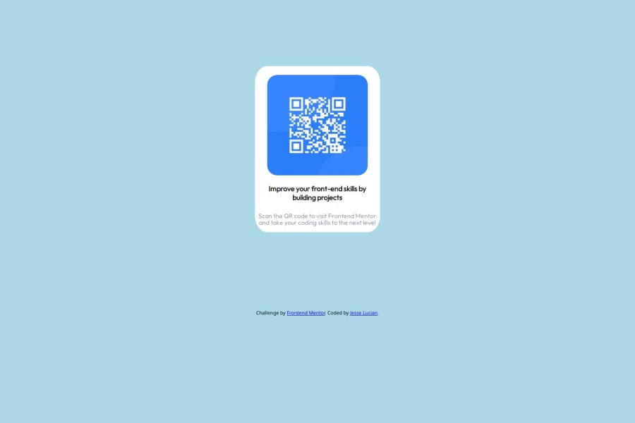
So this was my first project I started with FEM, so me and this one go way back. I was new to really working optimizing web pages- I knew about media queries, I just wasn't used to working with them, so this took a lot of figuring out for me. I didn't even figure out how to modify it for the desktop view, so I just kind of sought assistance from an AI, and learned... never go to an AI to help you write your code, because it way overcomplicated the code that I was writing, and basically I was using a lot of clamps and the calc function to center things. So eventually I just kind of had to rewrite a lot of the CSS entirely. I also used relative instead of absolute positioning for the text elements unlike what I've been doing, which has made things a little bit easier and cleaned things up a little bit. And I'm mostly satisfied with how this came out. If anything I just think the text is a little bit too close to the bottom of the container. So if you have any feedback and suggestions on how I can improve on this one, or improve in the future, I'm open to it!
Community feedback
Please log in to post a comment
Log in with GitHubJoin our Discord community
Join thousands of Frontend Mentor community members taking the challenges, sharing resources, helping each other, and chatting about all things front-end!
Join our Discord