

Design comparison

Solution retrospective
Hello everyone! 👋
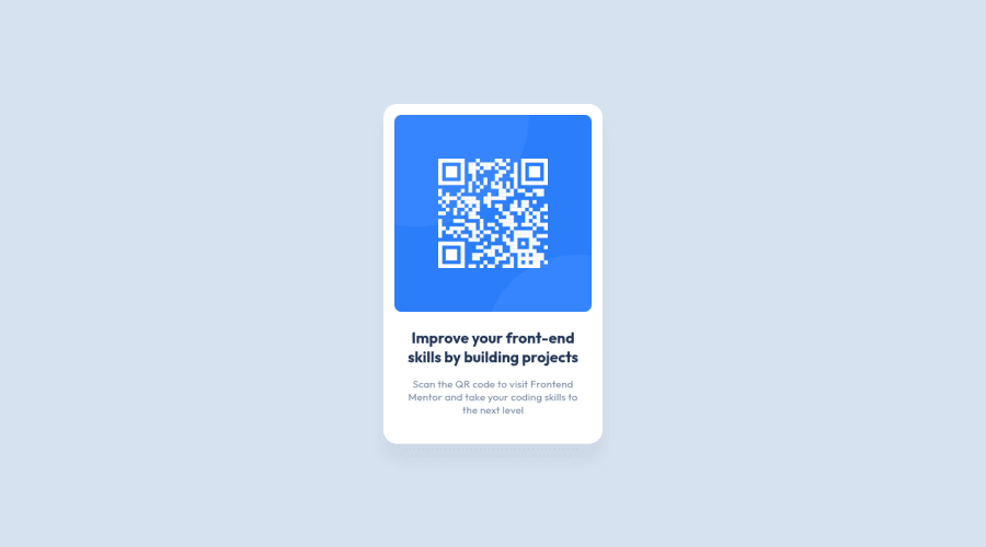
Today I completed another Frontend Mentor Challenge. I am doing the #100DaysOfCode and today I wanted to do some Frontend. I only had to use some HTML and CSS for this solution , so it was a quick and fun excersise. I used a Mobile-First approach and later tried to adapt the styling to a Desktop view. Because the card had the same look on both devices, I only had to change a couple of lines.
❓️ Question I now gave the main (/card) a max-width in rem. Is there a better solution to make the card desktop-friendly?
I would much like to become a better developer, so any advice you can give me is very welcome, also if it does not regard my specific question.
Have a nice day! 🙋♂️
Community feedback
Please log in to post a comment
Log in with GitHub
Join our Discord community
Join thousands of Frontend Mentor community members taking the challenges, sharing resources, helping each other, and chatting about all things front-end!
Join our Discord