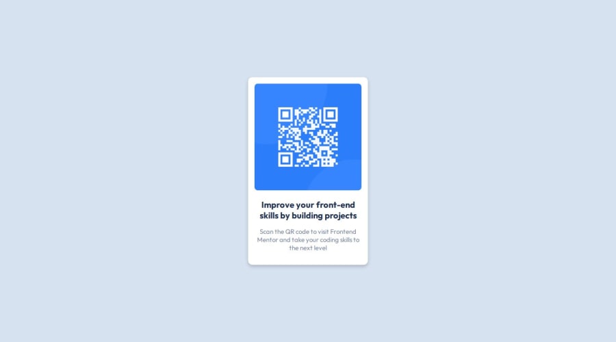
Design comparison
Solution retrospective
I have just completed my first challenge. I am pumped up.
What challenges did you encounter, and how did you overcome them?Centering divs has been an issue for me but I am happy I found a way to fix it
What specific areas of your project would you like help with?I want to learn how to write better codes with fewer lines.
Community feedback
- @Islandstone89Posted 8 months ago
HTML:
-
You don't need to write
role="main"
, as that is implicit when using the<main>
element. -
The alt text must also say where it leads(frontendmentor.io).
CSS:
-
It's good practice to include a CSS Reset at the top.
-
Add around
1rem
ofpadding
on thebody
, so the card doesn't touch the edges on small screens. -
Remove
width
andheight
onbody
. Thebody
is a block element, which means it fills the available width by default. And while you do need to givebody
a height to be able to center the card vertically(by default, thebody
is only as tall as its content), there is a better way than using100%
. -
You should not use
position
andtransform
to center the card, so remove those properties. -
To center the card horizontally and vertically, use Flexbox on the body:
display: flex; flex-direction: column; justify-content: center; align-items: center; min-height: 100svh;
The reason we're using
min-height
instead ofheight
is because this way, the content will not get cut off if it grows beneath the viewport.-
Remove the width on the card.
-
Add a
max-width
of around20rem
on the card, to prevent it from getting too wide on larger screens. -
font-size
must never be in px. This is a big accessibility issue, as it prevents the font size from scaling with the user's default setting in the browser. Use rem instead. -
On the image, add
display: block
and changewidth
tomax-width: 100%
- the max-width prevents it from overflowing its container.
Marked as helpful1@holabayorPosted 8 months ago@Islandstone89 Thank you for the corrections. I'll make the changes.
1 -
- @bc464Posted 8 months ago
Hi, Congratulations on your first project. Code looks structured and readable. A suggestion to consider for future projects, with regards to determining the size of the container, if you are using windows, under Windows Accessories use Paint [on the preview provided in the design] and set the gridlines option, that will enable you to determine the pixel width and height. Keep the momentum going and enjoy the learning process.
Marked as helpful1 - @Genrex7Posted 8 months ago
Nice work. Code is easily well-structured, readable and reusable. Can increase the width and height of the qr__container. Layout looks good on a range of screen sizes.
Marked as helpful1
Please log in to post a comment
Log in with GitHubJoin our Discord community
Join thousands of Frontend Mentor community members taking the challenges, sharing resources, helping each other, and chatting about all things front-end!
Join our Discord