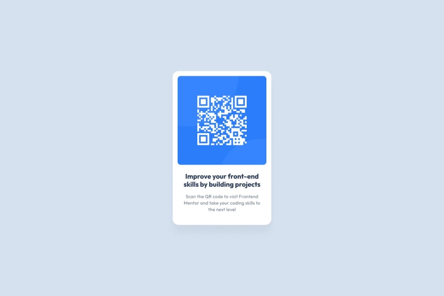
Design comparison
Solution retrospective
I did it by myself.
What challenges did you encounter, and how did you overcome them?Trying to center the card vertically. I thought I could use only "margin: auto auto;" but ended ut using flex with justify-content and align-items.
What specific areas of your project would you like help with?Possibly the text isn't aligned with the QR image as it shows on the design images.
Community feedback
- @danielmrz-devPosted 7 months ago
Hello there!
Congrats on completing the challenge! ✅
Your solution looks great!
I have a suggestion for improvement:
📌 Think about using
<main>to wrap your main content instead of<div>.Imagine
<div>and<span>in HTML as basic containers. They're good for holding stuff, but they don't tell us much about what's inside or its purpose on the webpage.This change might not have impact on how your page looks, but it'll make your HTML code clearer and help with SEO and accessibility.
Hope that's helpful!
Keep up the great work!
Marked as helpful1 - @DivadovitchPosted 7 months ago
nice work. Indeed if the title in h1 was just a little bigger and there was less padding on the left and right of the texts the result would be identical. A small remark regarding the border-radius, as they are in "%" when the card becomes smaller the corners are deformed, it seems to me that using the "rem" allows you to avoid this deformation. congratulations for the work accomplished
Marked as helpful1
Please log in to post a comment
Log in with GitHubJoin our Discord community
Join thousands of Frontend Mentor community members taking the challenges, sharing resources, helping each other, and chatting about all things front-end!
Join our Discord
