Design comparison
Community feedback
- @DreamleafPosted 11 months ago
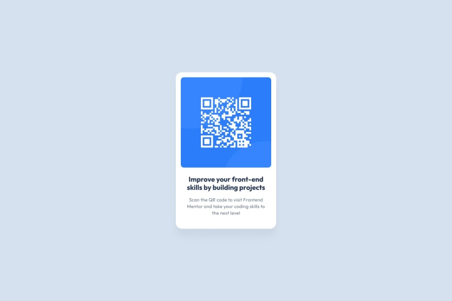
A couple of points about the text elements in the card.
-
You have both the title and text within p tags, ideally there should be a heading within the element. So you could have made the "improve your...." text a h1 element. In a real world situation, there would likely be other things on the page and the title may be better suited as a h2.
-
You have both text sections set with a single font size, the design has them differently - and while there is a bit of trial and error needed, you could have styled them accordingly.
-
When you declare the font - always include a fall back font if the main choice is being pulled in from an external source. This way if there is an issue with the fonts loading, you still control how it looks. For this you just need to write:
font-family: outfit, sans-serif; -
Look at using REMs for the font sizing instead of PX values, definitely have a read up on the difference and why it is better.
Keep going though, every time you write code it will improve.
1 -
- @ddkogitPosted 11 months ago
you got it right but look at the padding and margin. Try using flexbox, it will be so much easier.
1
Please log in to post a comment
Log in with GitHubJoin our Discord community
Join thousands of Frontend Mentor community members taking the challenges, sharing resources, helping each other, and chatting about all things front-end!
Join our Discord
