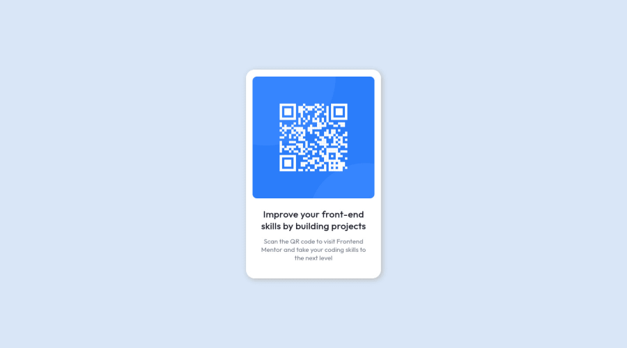
Design comparison
Solution retrospective
Hi there, I build this with html and css only my design looks similar to the original one. But if you find any bug or an error in my code than please tell me or share the solution π
Community feedback
- @visualdennissPosted over 1 year ago
Hey there,
very nice work!
However i'd suggest an easier method and more flexible method for centering the card on the page, instead of using position absolute, use GRID or FLEXBOX like this e.g.:
body { background-color: rgb(216, 230, 247); min-height: 100vh; display: grid; place-items: center; }
Positioning absolute for big sections might cause issues when there are more elements on the page. It should usually be used for smaller elements like decoration image etc.
Hope you find this feedback helpful!
Marked as helpful0@Umer-KhokharPosted over 1 year ago@visualdenniss Thanks for your feedback, I also know the flexbox centering method, however you are right that positioning the absolute may cause problems so for now, I always preffer to use flexfox option
0@visualdennissPosted over 1 year ago@Umer-Khokhar No problem, happy to be helpful!
Marked as helpful0 - @0xabdulkhaliqPosted over 1 year ago
Hello there π. Congratulations on successfully completing the challenge! π
- I have other recommendations regarding your code that I believe will be of great interest to you.
HTML π·οΈ:
- This solution generates accessibility error reports, "All page content should be contained by landmarks" is due to
non-semantic
markup, which lack landmark for a webpage
- So fix it by replacing the
<div class="container">
element with the semantic element<main>
in yourindex.html
file to improve accessibility and organization of your page.
- What is meant by landmark ?, They used to define major sections of your page instead of relying on generic elements like
<div>
or<span>
- They convey the structure of your page. For example, the
<main>
element should include all content directly related to the page's main idea, so there should only be one per page
HEADINGS β οΈ:
- And, this solution has also generated accessibility error report due to lack of level-one heading
<h1>
- Every site must want at least one
h1
element identifying and describing the main content of the page.
- An
h1
heading provides an important navigation point for users of assistive technologies, allowing them to easily find the main content of the page.
- So we want to add a level-one heading to improve accessibility by reading aloud the heading by screen readers, you can achieve this by adding a
sr-only
class to hide it from visual users (it will be useful for visually impaired users)
.
I hope you find this helpful π Above all, the solution you submitted is great !
Happy coding!
Marked as helpful0@Umer-KhokharPosted over 1 year ago@0xAbdulKhalid Great thanks to your feedback π
0
Please log in to post a comment
Log in with GitHubJoin our Discord community
Join thousands of Frontend Mentor community members taking the challenges, sharing resources, helping each other, and chatting about all things front-end!
Join our Discord